What style is this?这是什么风格?
What style is this? The visual styles atlas. Recognize the look, learn its real name and the 3–5 signals that make it, and tell it from its closest look‑alike. Then copy a brief your coding agent can build from.
这是什么风格?视觉风格图鉴。认出这种观感,学会它的真名和构成它的 3–5 个信号,并把它和最容易「撞脸」的相似风格区分开。然后复制一份 brief,你的 AI 编程代理可以直接照着构建。
A governed atlas, not a style dump 有治理的图鉴,不是风格仓库
There is no honest list of “all design styles.” A style ships here only with a credible source, a terminology-status label, defensible defining signals, and a specimen you can actually recognize. In research now:
世上不存在一份诚实的「所有设计风格」清单。一个风格只有具备可信的来源、术语状态标签、经得起推敲的定义信号,以及你真正能认出来的实例,才会收录于此。正在研究:
64 styles — recognize the look, learn its real name64 种风格 —— 认出长相,学会真名
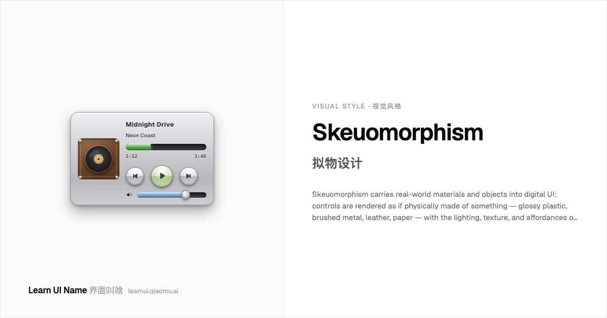
Skeuomorphism 拟物设计
Skeuomorphism carries real-world materials and objects into digital UI: controls are rendered as if physically made of something — glossy plastic, brushed metal, leather, paper — with the lighting, texture, and affordances of the real thing. A skeuomorphic app teaches itself: a page that looks tearable invites turning, a raised glossy button invites pressing. It peaked in early iOS and Mac OS X, and was largely displaced by flat design around 2013.
拟物设计把真实世界的材质和物件搬进数字界面:控件被渲染得像真的由某种材料做成 —— 亮面塑料、拉丝金属、皮革、纸张 —— 带着实物的光照、质感和可操作性暗示。拟物的 App 自带说明:看起来像能撕的页面会邀请你翻页,一颗凸起的光面按钮会邀请你按下去。它在早期 iOS 和 Mac OS X 达到巅峰,2013 年前后基本被扁平设计取代。
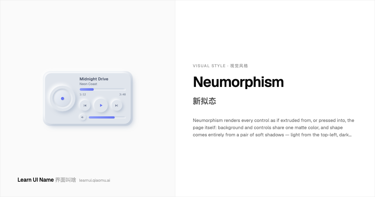
Neumorphism 新拟态
Neumorphism renders every control as if extruded from, or pressed into, the page itself: background and controls share one matte color, and shape comes entirely from a pair of soft shadows — light from the top-left, dark toward the bottom-right. Nothing has a border and nothing floats; the whole interface reads as one continuous molded surface. It photographs beautifully and tests poorly: the same softness that makes it distinctive erases the contrast real controls need.
新拟态把每个控件都渲染得像从页面本身挤出来、或压进去的一样:背景和控件共享同一种哑光色,形状完全来自一对柔和阴影 —— 亮部朝左上,暗部朝右下。没有描边,也没有悬浮;整个界面读起来就是一块连续的模压表面。它截图好看,实测糟糕:正是那份让它出挑的柔和,抹掉了真实控件所需的对比度。
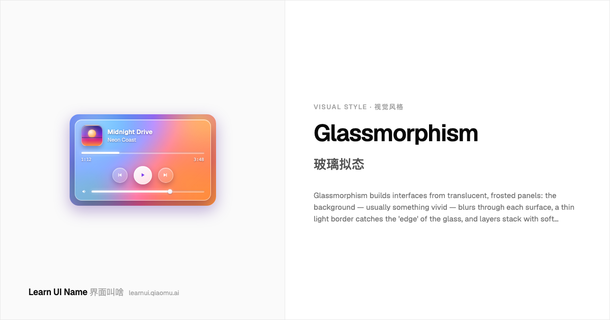
Glassmorphism 玻璃拟态
Glassmorphism builds interfaces from translucent, frosted panels: the background — usually something vivid — blurs through each surface, a thin light border catches the 'edge' of the glass, and layers stack with soft shadows to sell the depth. The style lives or dies by its backdrop: over a plain background the glass reads as plain grey; over a colorful gradient it glows.
玻璃拟态用半透明的磨砂玻璃面板搭建界面:背景 —— 通常是鲜艳的东西 —— 透过每一层表面模糊地显出来,一条细细的浅色描边勾住玻璃的「边缘」,层与层之间用柔和的投影堆出纵深。这个风格的生死全看背景:背景平淡,玻璃就只是一片灰;背景是彩色渐变,它就发光。
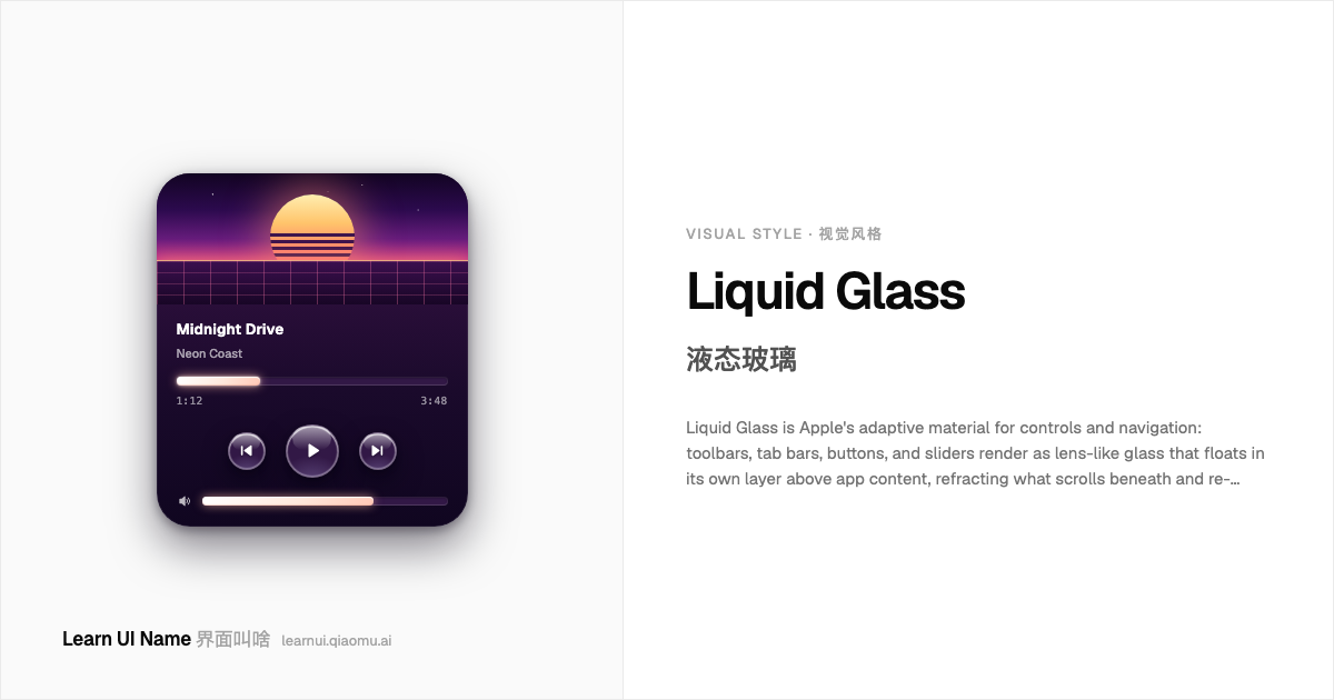
Liquid Glass 液态玻璃
Liquid Glass is Apple's adaptive material for controls and navigation: toolbars, tab bars, buttons, and sliders render as lens-like glass that floats in its own layer above app content, refracting what scrolls beneath and re-tinting itself for legibility in light and dark contexts. It is functional, not decorative — Apple applies it to the control layer and keeps content itself opaque. Capsule shapes and concentric corner radii are part of the geometry.
液态玻璃是 Apple 为控件和导航准备的自适应材质:工具栏、标签栏、按钮和滑块渲染成透镜般的玻璃,悬浮在应用内容上方自己那一层里,对下方滚过的内容做透镜折光,并随明暗环境重新给自己染色以保持可读。它是功能性的,不是装饰性的 —— Apple 只把它用在控制层,内容本身保持不透明。胶囊造型和同心圆角半径也是这套几何语言的一部分。
Web Brutalism 网页粗野主义
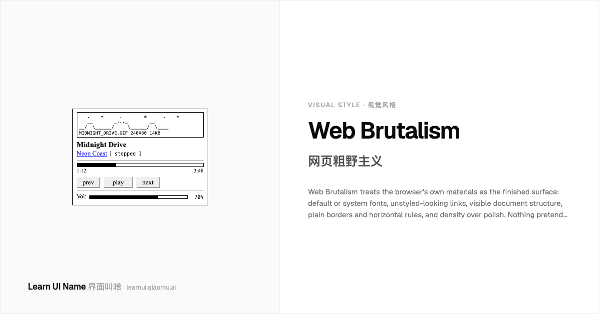
Web Brutalism treats the browser's own materials as the finished surface: default or system fonts, unstyled-looking links, visible document structure, plain borders and horizontal rules, and density over polish. Nothing pretends to be anything else — no gradients imitating glass, no shadows imitating depth. At its best it's honest and fast (Craigslist, Hacker News, early-web personal sites); at its worst the label gets stretched over anything unpolished.
网页粗野主义把浏览器自带的材料当作最终成品表面:默认或系统字体、看上去没加样式的链接、清晰可见的文档结构、朴素的边框和水平分隔线,以及重密度轻修饰。没有任何东西假装成别的东西——没有模仿玻璃的渐变,也没有假装深度的阴影。做得好时它诚实而飞快(Craigslist、Hacker News、早期网络的个人网站);做得差时,这个标签会被随便贴在任何不精致的东西上。
Neobrutalism 新粗野主义
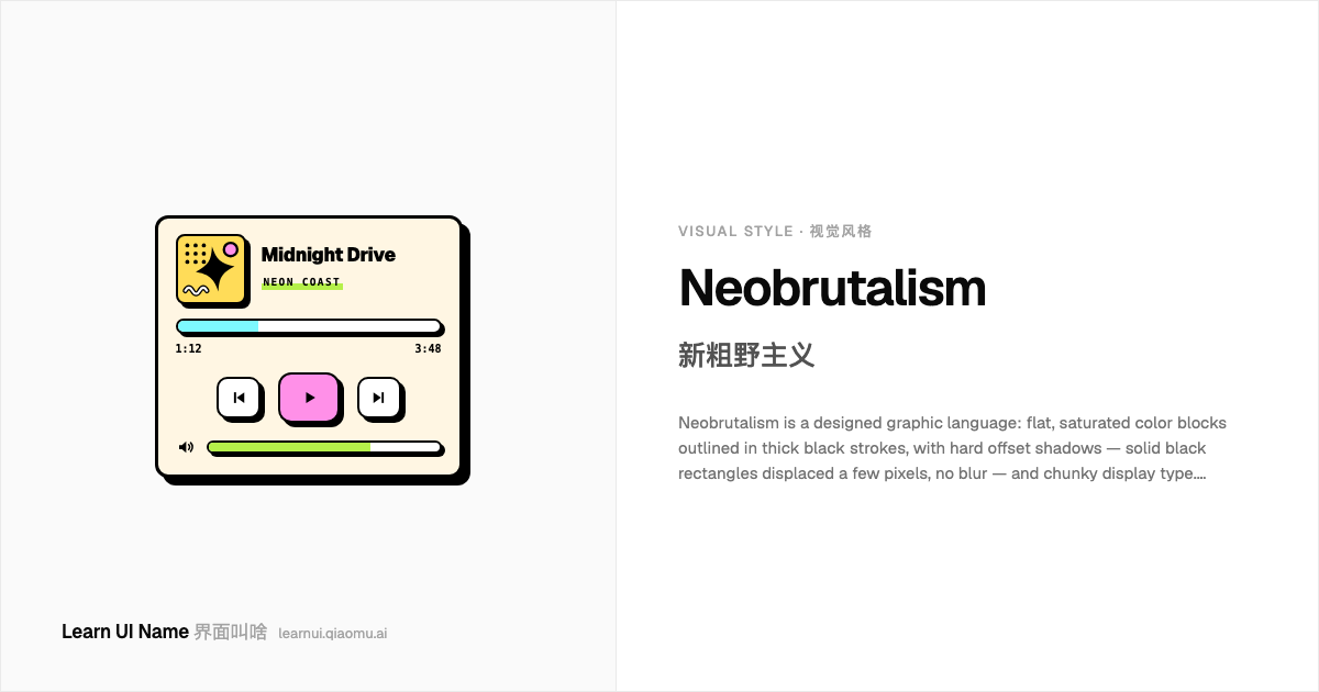
Neobrutalism is a designed graphic language: flat, saturated color blocks outlined in thick black strokes, with hard offset shadows — solid black rectangles displaced a few pixels, no blur — and chunky display type. Elements read like stickers or risograph prints; pressing a button often physically 'pushes' it into its shadow. Despite the name it is the opposite of raw: every border and shadow is a deliberate illustration choice.
新粗野主义是一套设计出来的图形语言:扁平的饱和色块勾着粗黑描边,配上生硬偏移阴影——纯黑矩形偏移几个像素、零模糊——再加上粗壮展示字体。元素读起来像贴纸或 Riso 孔版印刷品;按下按钮时,它常常真的被物理地「按进」自己的阴影里。名字里虽有粗野,它却是「生」的反面:每一道边框和阴影都是刻意的插画选择。
Y2K Digital Aesthetic Y2K 数字美学
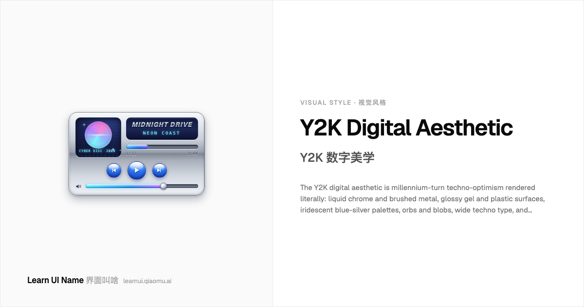
The Y2K digital aesthetic is millennium-turn techno-optimism rendered literally: liquid chrome and brushed metal, glossy gel and plastic surfaces, iridescent blue-silver palettes, orbs and blobs, wide techno type, and rendered 3D everything. It's the look of a future imagined through new consumer tech — translucent iMacs, early CGI, rave flyers, and 'cyber' branding — shiny, synthetic, and unembarrassed.
Y2K 数字美学是把千禧之交的技术乐观主义照字面渲染出来:液态铬和拉丝金属、亮泽的凝胶与塑料表面、幻彩的蓝银配色、球体与液滴形、宽体科技字体,以及万物皆可 3D 渲染。那是透过新消费科技想象出来的未来模样 —— 半透明 iMac、早期 CGI、锐舞传单和打着 “cyber” 旗号的品牌设计 —— 闪亮、合成,而且理直气壮。
Frutiger Aero Frutiger Aero
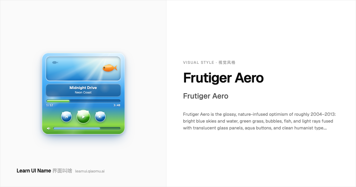
Frutiger Aero is the glossy, nature-infused optimism of roughly 2004–2013: bright blue skies and water, green grass, bubbles, fish, and light rays fused with translucent glass panels, aqua buttons, and clean humanist type. Technology presents itself as fresh, ecological, and frictionless — the future as a sunny day. It's the era of Windows Vista/7 wallpapers, glossy media players, and Web 2.0 product sites.
Frutiger Aero 是大约 2004–2013 年间那种亮泽的、浸透自然元素的乐观主义:明亮的蓝天碧水、绿草、泡泡、游鱼和光线,与半透明玻璃面板、aqua 质感按钮、干净的人文主义字体融为一体。科技把自己呈现得清新、生态、无摩擦 —— 未来就是一个晴天。那是 Windows Vista/7 壁纸、亮面媒体播放器和 Web 2.0 产品网站的时代。
Flat Design 扁平设计
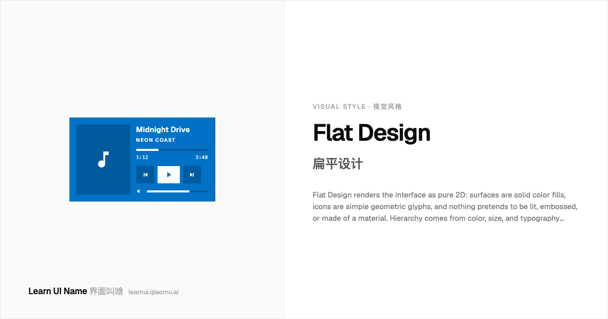
Flat Design renders the interface as pure 2D: surfaces are solid color fills, icons are simple geometric glyphs, and nothing pretends to be lit, embossed, or made of a material. Hierarchy comes from color, size, and typography instead of shadows and bevels. It became the dominant look around 2012–2013 (Windows 8's Metro, then iOS 7) as the direct rejection of skeuomorphism's gloss and texture.
扁平设计把界面渲染成纯粹的 2D:表面是纯色填充,图标是简单的几何字形,没有任何东西假装被打光、压凸或由某种材质制成。层级来自颜色、尺寸和排版,而不是阴影和斜面。它在 2012–2013 年前后(Windows 8 的 Metro,然后是 iOS 7)成为主流外观,是对拟物设计的光泽与质感的直接反叛。
Minimalism 极简主义
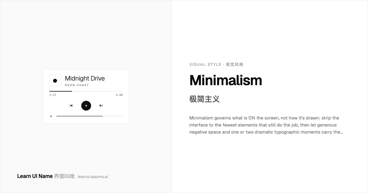
Minimalism governs what is ON the screen, not how it's drawn: strip the interface to the fewest elements that still do the job, then let generous negative space and one or two dramatic typographic moments carry the composition. NN/g's study of 112 minimalist sites found the recurring traits — flat-ish surfaces, limited or monochrome palettes, restricted element counts, negative space, and large type as the hero.
极简主义管的是屏幕上「有什么」,而不是「怎么画」:把界面削到仍能完成任务的最少元素,然后让慷慨的留白和一两处戏剧性的排版时刻撑起整个构图。NN/g 研究了 112 个极简网站,归纳出反复出现的特征——偏扁平的表面、有限或单色的配色、受控的元素数量、留白,以及作为主角的大字号。
Claymorphism 黏土拟态
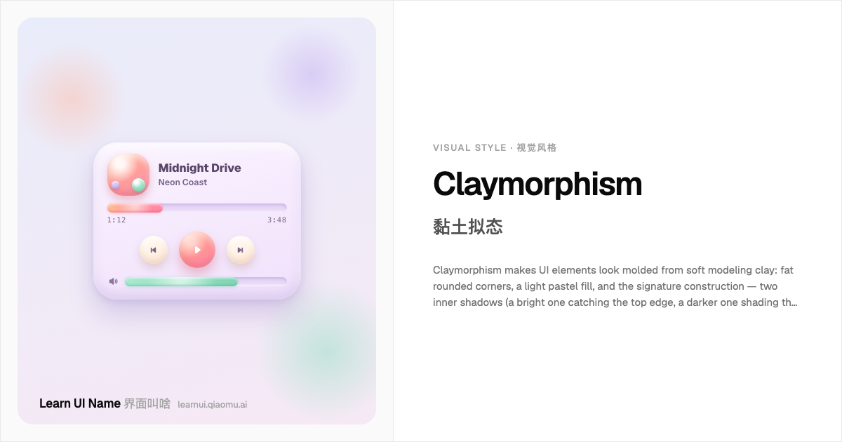
Claymorphism makes UI elements look molded from soft modeling clay: fat rounded corners, a light pastel fill, and the signature construction — two inner shadows (a bright one catching the top edge, a darker one shading the bottom) plus one soft outer drop shadow that floats the object above the page. Each element is independently colored and clearly separate from the background, usually paired with chunky 3D 'clay' illustrations.
黏土拟态让 UI 元素看起来像用软陶土捏出来的:肥肥的圆角、淡淡的粉彩填充,还有标志性的结构——两层内阴影(亮的一层落在顶边,暗的一层垫在底部)加一层柔和的外投影,把物体托浮在页面上方。每个元素独立上色、与背景明显分离,通常再配上一组胖乎乎的 3D「黏土」插画。
Vernacular Web 民间网页(Vernacular Web)
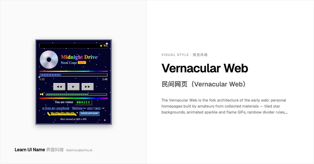
The Vernacular Web is the folk architecture of the early web: personal homepages built by amateurs from collected materials — tiled star backgrounds, animated sparkle and flame GIFs, rainbow divider rules, 'welcome to my home page' banners, visitor counters, guestbook links, under-construction signs, and webring badges. It is decorative, personal, and sincere: every ornament was chosen because its owner loved it, not because a system prescribed it.
民间网页是早期网络的民间建筑:业余爱好者用收集来的素材搭起的个人主页——平铺的星空背景、闪动的亮片和火焰 GIF、彩虹分隔线、「欢迎来到我的主页」横幅、访客计数器、留言簿链接、施工中标志和网页环(webring)徽章。它装饰性强、私人、真诚:每一件饰品被选中都是因为主人喜欢,而不是某套体系的规定。
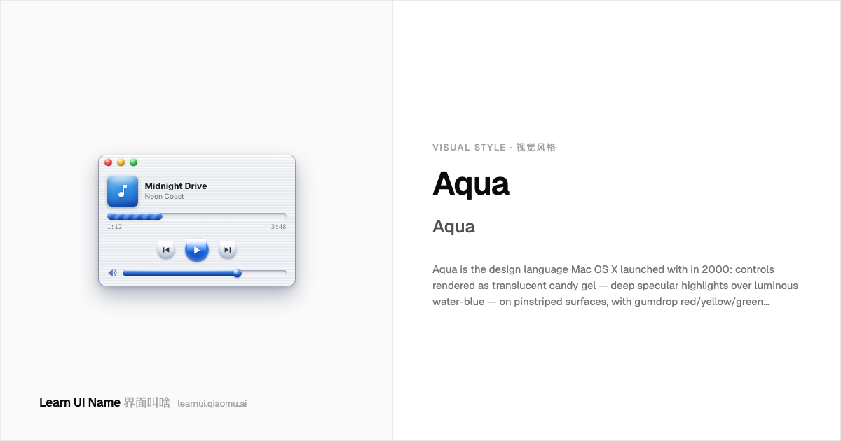
Aqua Aqua
Aqua is the design language Mac OS X launched with in 2000: controls rendered as translucent candy gel — deep specular highlights over luminous water-blue — on pinstriped surfaces, with gumdrop red/yellow/green window controls, soft drop shadows layering the windows, and fluid animation everywhere (the default button literally pulsed, and windows poured into the Dock through the genie effect). Apple pitched it as an interface with the fluidity and depth of water.
Aqua 是 Mac OS X 在 2000 年问世时搭载的设计语言:控件被渲染成半透明的糖果凝胶 —— 莹亮的水蓝色上压着深深的高光 —— 铺在细条纹表面上,配上软糖般的红黄绿窗口按钮、把窗口分出层次的柔和投影,以及无处不在的流畅动画(默认按钮真的会一下一下地脉动,窗口通过精灵效果像水一样流进 Dock)。苹果把它宣传成一个有着水的流动感与深度的界面。
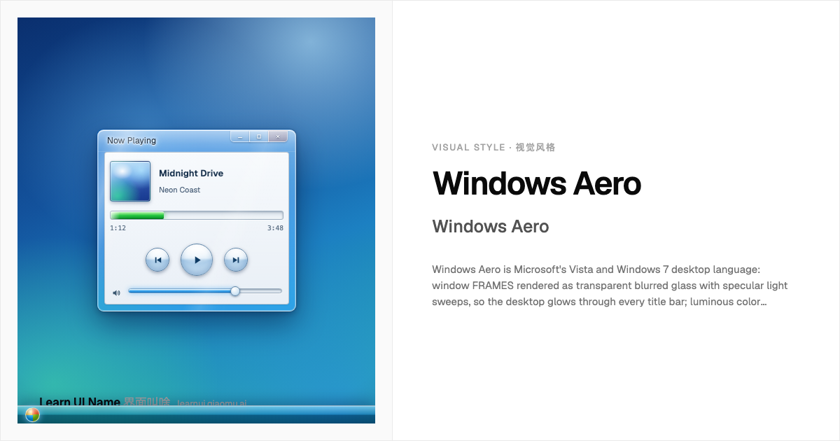
Windows Aero Windows Aero
Windows Aero is Microsoft's Vista and Windows 7 desktop language: window FRAMES rendered as transparent blurred glass with specular light sweeps, so the desktop glows through every title bar; luminous color gradients; caption buttons that light up under the cursor (the red close glow); shimmering green progress bars; and smooth window motion like Flip 3D and the minimize animation. Microsoft's launch messaging named the glass, the reflections, and the animation as the product.
Windows Aero 是微软 Vista 和 Windows 7 的桌面语言:窗口边框被渲染成透明的毛玻璃,上面有镜面光扫过,桌面得以透过每一条标题栏发光;莹亮的色彩渐变;光标移上去就会点亮的标题栏按钮(红色的关闭键辉光);泛着波光的绿色进度条;以及 Flip 3D 和最小化动画这样流畅的窗口动效。微软当年的发布宣传直接把玻璃、反射和动画点名成了产品本身。
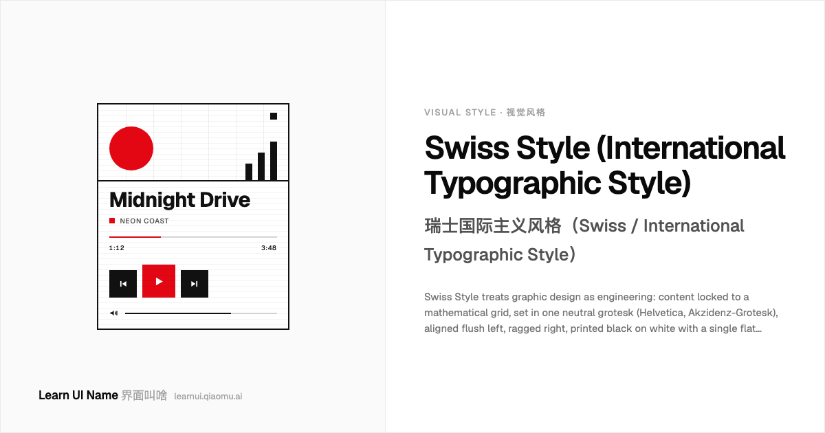
Swiss Style (International Typographic Style) 瑞士国际主义风格(Swiss / International Typographic Style)
Swiss Style treats graphic design as engineering: content locked to a mathematical grid, set in one neutral grotesk (Helvetica, Akzidenz-Grotesk), aligned flush left, ragged right, printed black on white with a single flat accent — classically Swiss red. Photography is objective documentation, never illustration; decoration is abolished. Crystallized in 1950s Switzerland, it became the default voice of corporate identity and wayfinding, and its grid logic still underpins most 'clean' interfaces.
瑞士国际主义风格把平面设计当作工程:内容锁定在数学网格上,用一种中性 grotesk 字体排印(Helvetica、Akzidenz-Grotesk),左对齐、右侧自然参差,白纸黑字只配一个扁平强调色 —— 经典是瑞士红。摄影是客观记录,绝不是插画;装饰被彻底废除。它于 1950 年代在瑞士成形,随后成为企业识别与导视系统的默认语言,其网格逻辑至今仍支撑着大多数「干净」的界面。
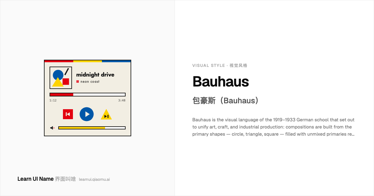
Bauhaus 包豪斯(Bauhaus)
Bauhaus is the visual language of the 1919–1933 German school that set out to unify art, craft, and industrial production: compositions are built from the primary shapes — circle, triangle, square — filled with unmixed primaries red, yellow, and blue against black and white, while headlines drop capital letters for Herbert Bayer's all-lowercase geometric alphabet. A century later it is still the default shorthand for geometric modernism in posters, logos, and landing pages.
包豪斯是 1919–1933 年德国那所设计学校的视觉语言,目标是统一艺术、工艺与工业生产:构图全部由基本几何形 —— 圆、三角、方 —— 搭建,填充不掺调的三原色红、黄、蓝,衬以黑白;标题则丢掉大写字母,改用 Herbert Bayer 式的全小写几何字母。一个世纪后,它仍是海报、Logo 和落地页里「几何现代主义」的默认代称。
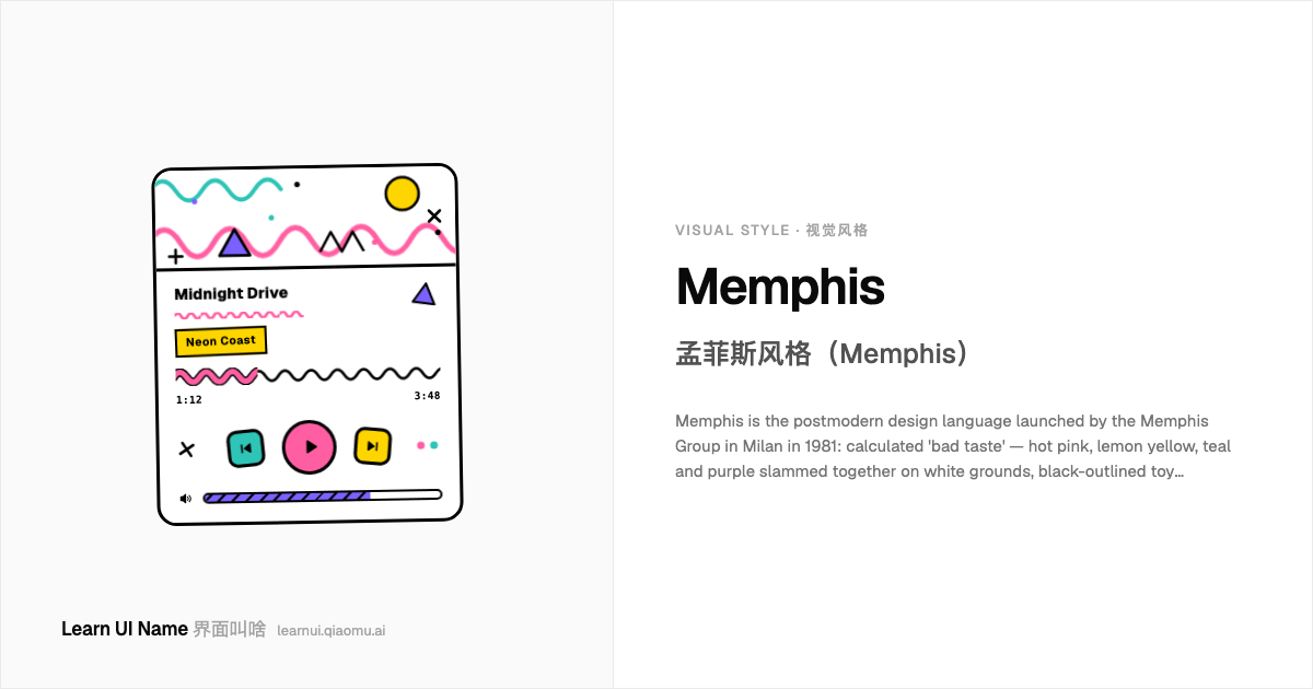
Memphis 孟菲斯风格(Memphis)
Memphis is the postmodern design language launched by the Memphis Group in Milan in 1981: calculated 'bad taste' — hot pink, lemon yellow, teal and purple slammed together on white grounds, black-outlined toy geometry, and an allover confetti of squiggles, zigzags, dots and triangles. Born as radical furniture in printed plastic laminate, it was mocked and worshipped alike, dissolved in 1987, and resurrected as the default visual shorthand for 'the eighties' in graphic and UI design.
孟菲斯风格是 1981 年由孟菲斯集团(Memphis Group)在米兰发起的后现代设计语言:精心算计的「坏品味」—— 艳粉、柠檬黄、青绿、紫在白色底上硬碰硬,描黑边的玩具感几何形,加上满版的波浪线、锯齿、圆点和三角纸屑。它出身是裹着印刷塑料层压板的激进家具,被同等程度地嘲笑和膜拜,1987 年解散,随后复活为平面与 UI 设计里「八十年代」的默认视觉代名词。
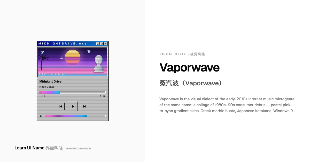
Vaporwave 蒸汽波(Vaporwave)
Vaporwave is the visual dialect of the early-2010s internet music microgenre of the same name: a collage of 1980s–90s consumer debris — pastel pink-to-cyan gradient skies, Greek marble busts, Japanese katakana, Windows 95 window chrome, palm-tree sunsets over grid floors — degraded with VHS scanlines, chromatic aberration, and glitch. It treats corporate-utopian imagery as found footage: dreamy, ironic, and worn. A nostalgia remix, not a period original.
蒸汽波是 2010 年代初网络同名音乐微流派的视觉方言:一幅 80–90 年代消费文化碎片的拼贴 —— 粉到青的粉彩渐变天空、希腊大理石雕像、日文片假名、Windows 95 窗口边框、网格地面上的棕榈树夕阳 —— 再叠上 VHS 扫描线、色差和故障效果做旧。它把企业乌托邦式的图像当现成素材带用:梦幻、讽刺、带着磨损感。是怀旧 remix,不是年代原作。
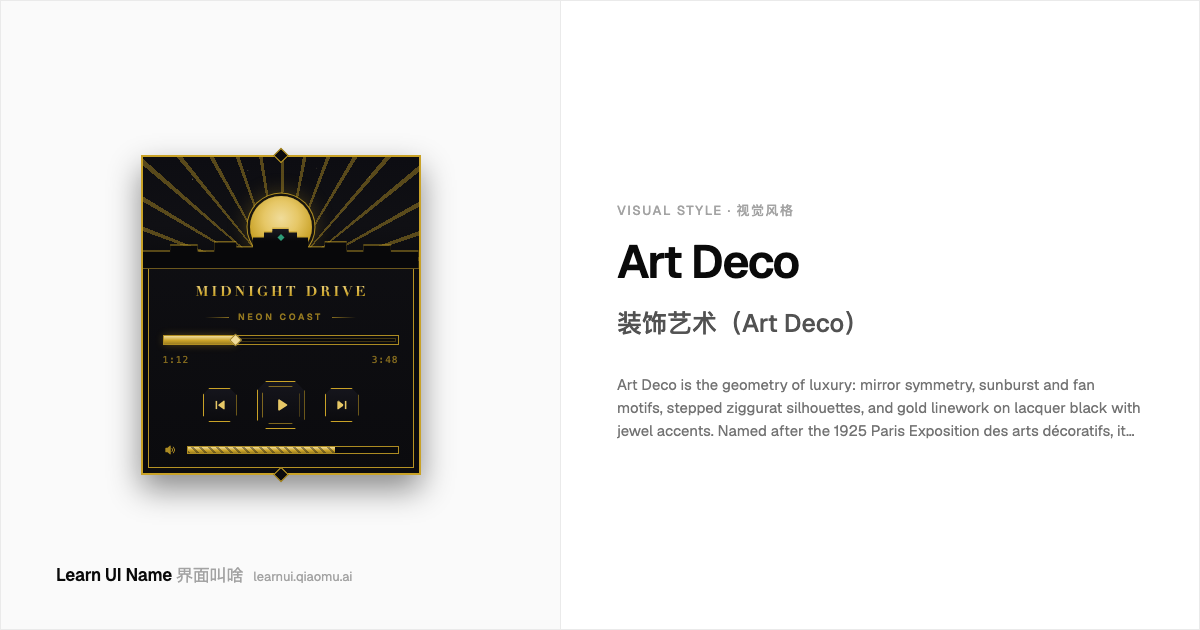
Art Deco 装饰艺术(Art Deco)
Art Deco is the geometry of luxury: mirror symmetry, sunburst and fan motifs, stepped ziggurat silhouettes, and gold linework on lacquer black with jewel accents. Named after the 1925 Paris Exposition des arts décoratifs, it gave the Chrysler Building its crown and Gatsby its glow. Where Bauhaus stripped geometry to function, Deco piled it on — gilded all-caps lettering and ornament dense enough to feel machined. It faded with wartime austerity and revives whenever design wants opulence.
装饰艺术是「奢华的几何」:镜像对称、太阳放射纹与扇形纹样、阶梯收分(ziggurat)轮廓,以及黑漆底色上的描金线条与宝石色点缀。风格因 1925 年巴黎装饰艺术博览会得名,克莱斯勒大厦的塔冠和盖茨比的流光都出自它。包豪斯把几何削到只剩功能,装饰艺术偏要往上堆 —— 描金的全大写题字、密到像机器刻出来的纹样。它随战时紧缩褪去,每当设计想要「奢」就会复兴。
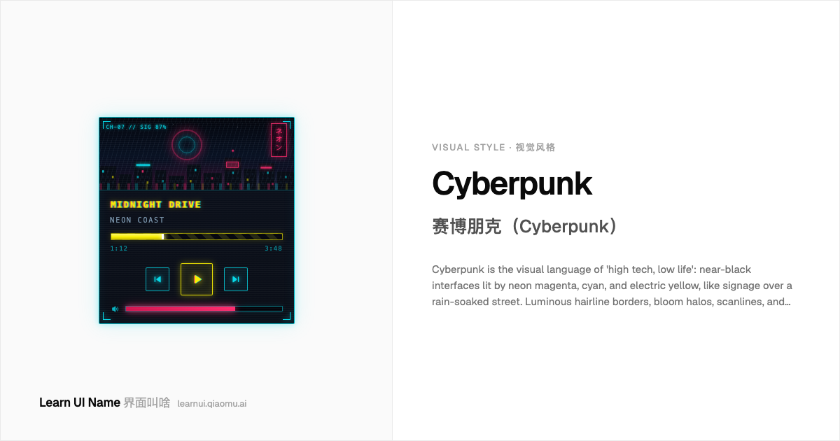
Cyberpunk 赛博朋克(Cyberpunk)
Cyberpunk is the visual language of 'high tech, low life': near-black interfaces lit by neon magenta, cyan, and electric yellow, like signage over a rain-soaked street. Luminous hairline borders, bloom halos, scanlines, and glitch tears turn panels into hacked terminals, while monospace type and HUD brackets supply the instrumentation. Born in 1980s science fiction and pushed into UI by films and games like Cyberpunk 2077, it treats darkness as the canvas — every accent must earn its glow.
赛博朋克是「高科技,低生活」(high tech, low life)的视觉语言:近黑的界面被霓虹品红、青、电黄点亮,像雨夜街道上方层层叠叠的招牌。发光的细描边、辉光、扫描线和故障撕裂把面板变成被黑的终端,等宽字体和 HUD 括线则提供仪器感。它诞生于 1980 年代科幻文学,经由《银翼杀手》式的电影和《赛博朋克 2077》这类游戏进入 UI——它把黑暗当作画布,每一笔亮色都得挣得自己的光。
Pixel Art 像素艺术(Pixel Art)
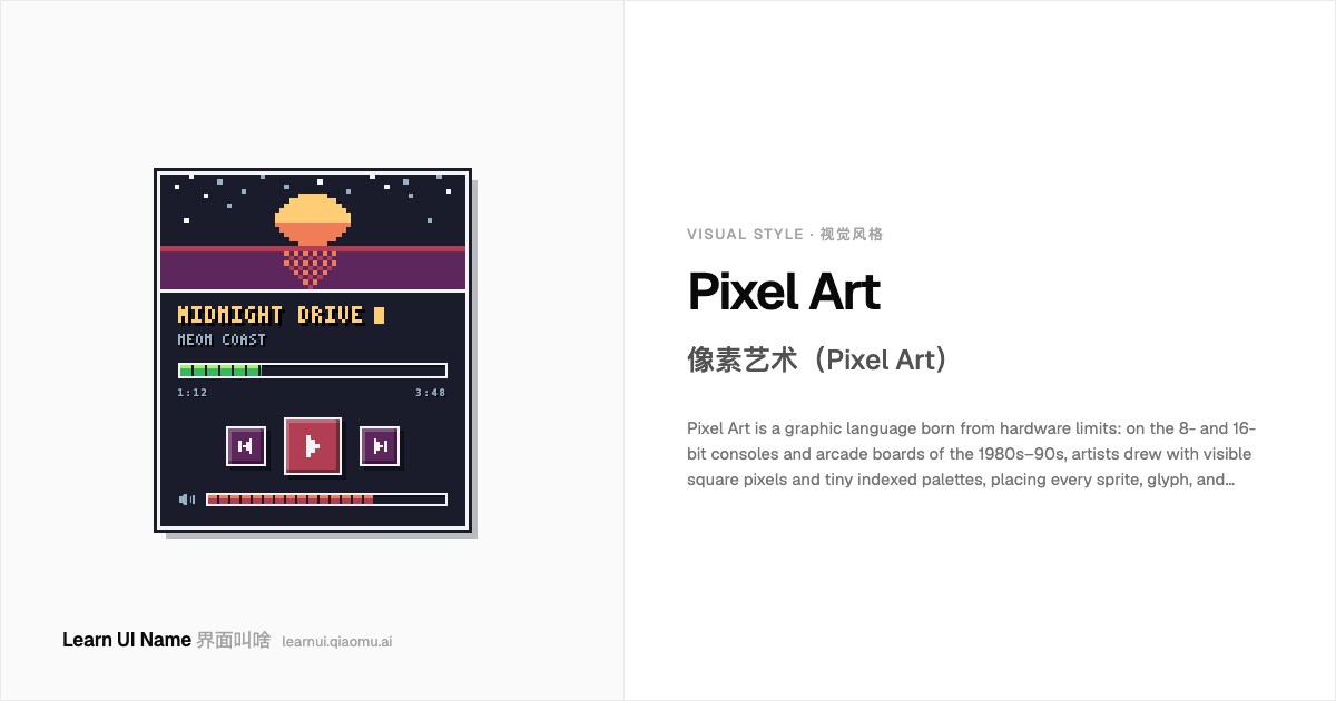
Pixel Art is a graphic language born from hardware limits: on the 8- and 16-bit consoles and arcade boards of the 1980s–90s, artists drew with visible square pixels and tiny indexed palettes, placing every sprite, glyph, and health bar pixel by pixel. What began as a constraint is now a deliberate retro aesthetic — crisp stair-stepped edges with no anti-aliasing, limited color ramps, dithered shading, chunky bitmap type, and frame-by-frame animation chosen for charm, not necessity.
像素艺术是一套诞生于硬件限制的图形语言:在 20 世纪 80–90 年代的 8/16 位游戏机和街机基板上,美术师用可见的方形像素和极小的索引色板作画,每一个精灵、每一个字形、每一根血条都逐像素摆放。曾经的限制如今成了刻意的复古美学 —— 无抗锯齿的阶梯状边缘、有限的渐变色阶、抖动(dithering)着色、粗粝的位图字体、逐帧小动画,为的是游戏时代的魅力,而不是迫不得已。
Corporate Memphis 企业孟菲斯(Corporate Memphis)
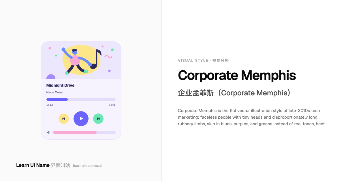
Corporate Memphis is the flat vector illustration style of late-2010s tech marketing: faceless people with tiny heads and disproportionately long, rubbery limbs, skin in blues, purples, and greens instead of real tones, bent into over-acted poses against blobs, dots, and arcs. Named after Alegria, the illustration system Facebook introduced around 2017, it became the default look of SaaS landing pages and empty states within years — then a byword for corporate sameness ('blanding').
企业孟菲斯是 2010 年代末科技营销的扁平矢量插画风格:没有五官的人物顶着小脑袋,四肢不成比例地又长又软,皮肤画成蓝、紫、绿而不是真实肤色,在色团、圆点和弧线之间摆出夸张的姿势。名字来自 Facebook 约 2017 年推出的插画系统 Alegria;几年内它就成了 SaaS 落地页和空状态的默认外观 —— 随后又成了「千站一面」的企业「平庸化」(blanding)代名词。
Material Design 质感设计(Material Design)
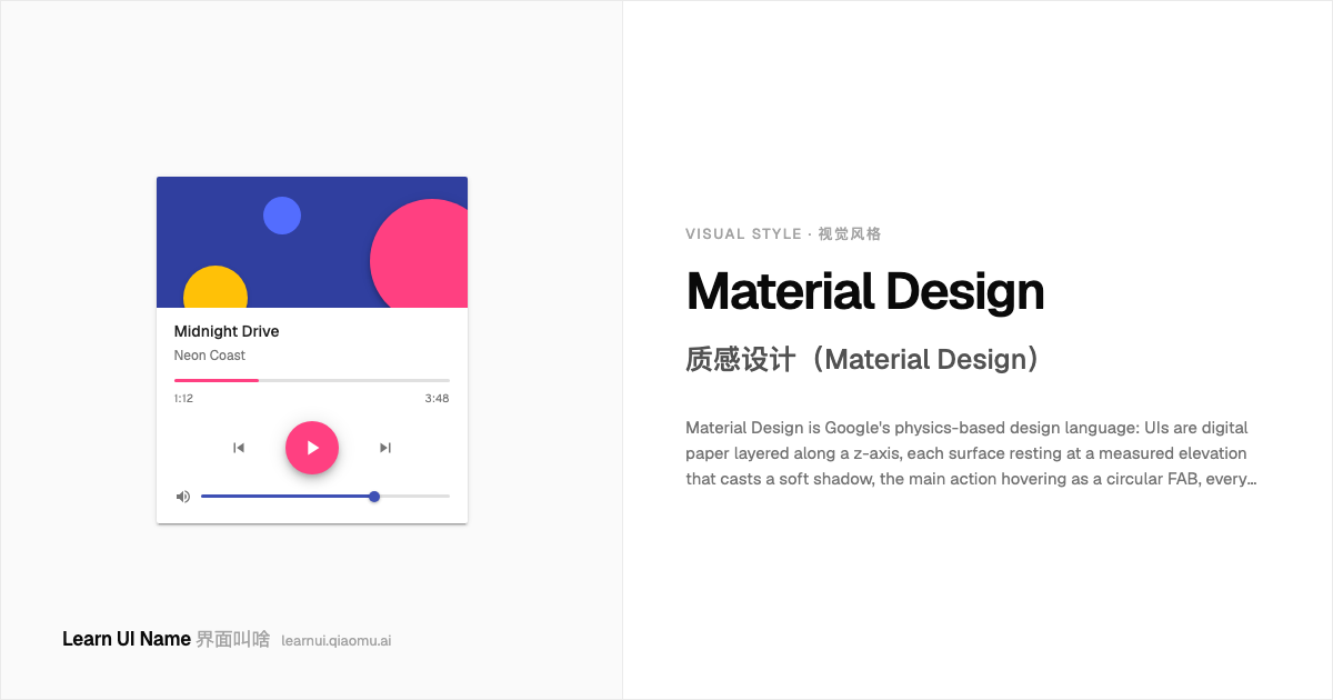
Material Design is Google's physics-based design language: UIs are digital paper layered along a z-axis, each surface resting at a measured elevation that casts a soft shadow, the main action hovering as a circular FAB, every touch answered with an ink ripple. Bold brand color, white cards, and Roboto type align to an 8dp grid, and motion expresses hierarchy. Shipped with Android 5.0 in 2014, it became Android's default look — the systematic rebuttal to flat design's shadowless austerity.
质感设计是 Google 基于物理隐喻的设计语言:界面是沿 z 轴叠放的数字纸张,每个表面停在一个可测量的 elevation 上、投下与高度对应的柔和阴影,主操作悬浮成一枚圆形 FAB,每次点按都用墨涟漪回应。大胆的品牌色、白色卡片和 Roboto 字体对齐在 8dp 网格上,动效负责表达层级。2014 年随 Android 5.0 发布,从此成为 Android 的默认观感 —— 对扁平设计「零阴影」美学的一次系统化回应。
Terminal Hacker 终端黑客风(Terminal / Hacker / CRT)
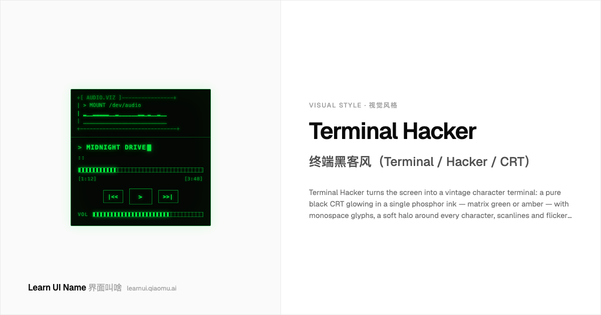
Terminal Hacker turns the screen into a vintage character terminal: a pure black CRT glowing in a single phosphor ink — matrix green or amber — with monospace glyphs, a soft halo around every character, scanlines and flicker laid over everything, and a blinking block cursor typing content out like a machine. Born from 1970s–80s hardware limits, canonized by hacker cinema and The Matrix, it is now pure retro-futurist costume: the interface pretends to be forty-year-old equipment.
终端黑客风把屏幕变成一台复古字符终端:纯黑的 CRT 上只亮着一种磷光墨色 —— 黑客帝国绿或琥珀色 —— 等宽字形、每个字符带一圈柔光晕、一切之上覆着扫描线和闪烁,还有一个闪烁的方块光标像机器一样把内容逐字打出来。它生于 1970–80 年代的硬件限制,被黑客电影和《黑客帝国》封圣,如今是纯粹的复古未来主义戏服:界面假装自己是一台四十岁的老设备。
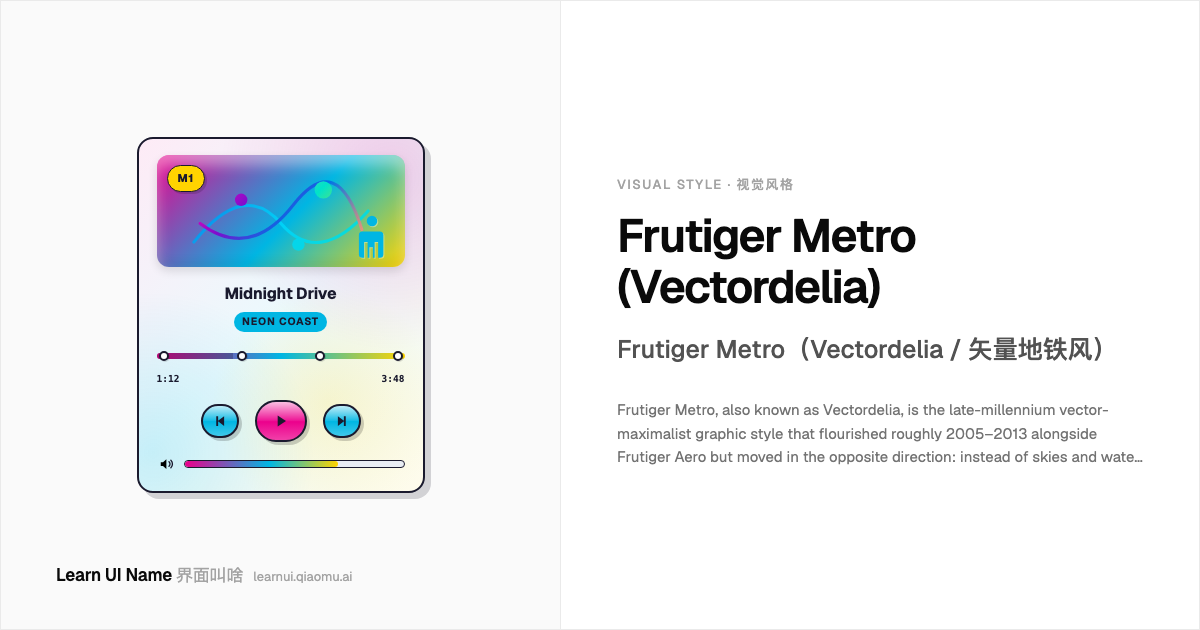
Frutiger Metro (Vectordelia) Frutiger Metro(Vectordelia / 矢量地铁风)
Frutiger Metro, also known as Vectordelia, is the late-millennium vector-maximalist graphic style that flourished roughly 2005–2013 alongside Frutiger Aero but moved in the opposite direction: instead of skies and water, it built cities out of pure vector — subway lines, bright saturated gradients, abstract floral flourishes and swirls, humanist sans type, glossy vector shapes, and multicolored silhouette figures. It is the visual language of iPod commercials, Xbox 360 dashboards, Windows 7 stock imagery, and city-themed event graphics: optimistic, urban, geometrically neat, and deliberately non-photorealistic.
Frutiger Metro,又称 Vectordelia(矢量地铁风),是与 Frutiger Aero 同时流行于大约 2005–2013 年的晚期千禧矢量极大主义风格,但走向完全相反的方向:它不用天空和水,而是用纯矢量建造城市 —— 地铁线路、明亮饱和的渐变块、抽象的花饰与漩涡、人主义无衬线字体、光泽矢量形状,以及多彩的人形剪影。它是 iPod 剪影广告、Xbox 360 仪表板、Windows 7 自带图库和城市主题活动画面的视觉语言:乐观、都市、几何整齐,并刻意不写实。
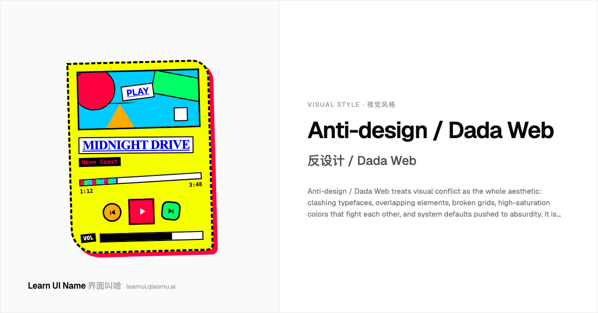
Anti-design / Dada Web 反设计 / Dada Web
Anti-design / Dada Web treats visual conflict as the whole aesthetic: clashing typefaces, overlapping elements, broken grids, high-saturation colors that fight each other, and system defaults pushed to absurdity. It is deliberately ugly, but ugly by design — a collage-like rebellion against clean UX, grid systems, and brand-safe palettes. It flourishes in experimental portfolios, zine sites, art-school projects, and any screen that wants to look like it escaped from a Dadaist cut-up magazine rather than a design system.
反设计 / Dada Web 把视觉冲突当作整套审美:冲突的字体、互相重叠的元素、破碎的网格、高饱和度且彼此打架的颜色,以及被推向荒诞的系统默认样式。它是故意做丑,但丑是设计出来的——像拼贴画一样反叛干净 UX、网格系统和品牌安全配色。它在实验性作品集、独立杂志风网站、艺术院校项目,以及任何想让自己看起来像从达达主义剪贴杂志里逃出来的屏幕上繁荣生长。
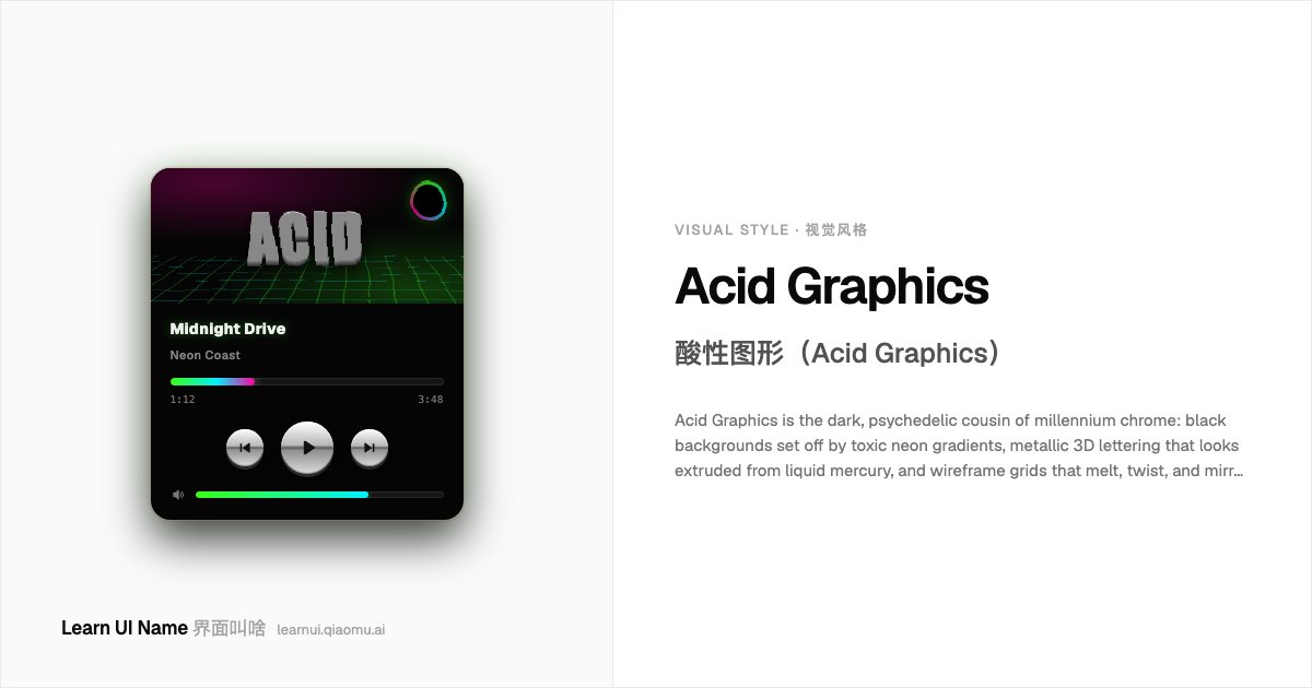
Acid Graphics 酸性图形(Acid Graphics)
Acid Graphics is the dark, psychedelic cousin of millennium chrome: black backgrounds set off by toxic neon gradients, metallic 3D lettering that looks extruded from liquid mercury, and wireframe grids that melt, twist, and mirror themselves into distortion. It grew out of 1990s acid-house and rave flyers, then was revived in the 2010s as a club-culture visual language for electronic music, streetwear, and underground editorial — less 'future that shipped' than a future seen through a funhouse lens.
酸性图形是千禧铬色风格的暗黑迷幻表亲:黑色底上炸开高饱和的霓虹渐变,像从液态汞里刚挤出来的金属 3D 字,以及融化、扭曲、镜像变形的线框网格。它从 1990 年代 acid house 与锐舞传单中生长出来,又在 2010 年代复苏,成为电子音乐、街头服饰和地下编辑设计的俱乐部视觉语言 —— 与其说是「已经发货的未来」,不如说是透过哈哈镜看到的未来。
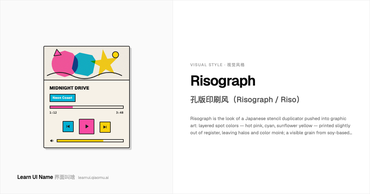
Risograph 孔版印刷风(Risograph / Riso)
Risograph is the look of a Japanese stencil duplicator pushed into graphic art: layered spot colors — hot pink, cyan, sunflower yellow — printed slightly out of register, leaving halos and color moiré; a visible grain from soy-based inks; and edges that look cut from a stencil rather than rendered by a laser. It migrated from churches and schools in the 1980s into zines, posters, and indie publishing, where its accidents became the signature.
孔版印刷风是把日本理想(Riso)公司的数字模版复印机推进平面艺术后形成的观感:用限定专色——荧光粉、青蓝、向日葵黄——一层层叠印,每层都轻微错位,留下光晕和叠色摩尔纹;大豆油墨带来可见颗粒;边缘像从蜡纸上裁下来,而不是激光切割般锐利。它在 1980 年代从教堂和学校走进 zine、海报和独立出版,原本的「失误」反倒成了签名。
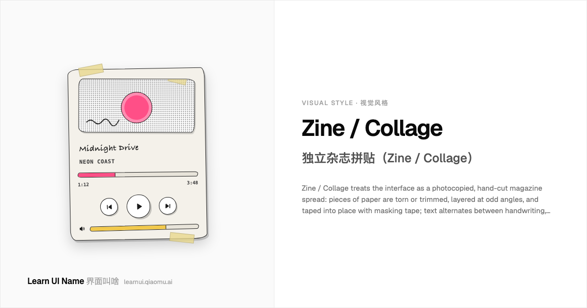
Zine / Collage 独立杂志拼贴(Zine / Collage)
Zine / Collage treats the interface as a photocopied, hand-cut magazine spread: pieces of paper are torn or trimmed, layered at odd angles, and taped into place with masking tape; text alternates between handwriting, typewriter, and clipped headlines, all sitting on a grainy, high-contrast, DIY surface. It is not polished — the scissor slip, the tape wrinkle, and the over-copied halftone are the whole point. The look migrated from punk fanzines and Riot Grrrl photocopies into web portfolios and editorial sites looking for warmth outside the SaaS grid.
独立杂志拼贴把界面当成一份复印过、手工剪贴的杂志内页:纸张被撕下或裁开,以奇怪角度层层叠放,再用胶带固定;文字在手写、打字机和剪报标题之间切换,全部落在粗糙、高对比、DIY 质感的表面上。它不精致——剪歪的边、皱起的胶带、复印过头的网点就是全部看点。这种风格从朋克 fanzine 和 Riot Grrrl 的复印件一路走进网页作品集和编辑型站点,寻找 SaaS 网格之外的手作温度。

Steampunk 蒸汽朋克(Steampunk)
Steampunk dresses the interface in the brass, leather and rivets of a Victorian machine room that never was: warm sepia grounds, burnished copper and bronze, gear-edged frames, engraved serif lettering, pressure-gauge meters and visible mechanical fasteners. It is retro-futurism from the age of steam — the screen pretending to be a 19th-century astrolabe, pocket watch or steamship console rather than a digital surface.
蒸汽朋克把界面装扮成一座从未存在的维多利亚机械车间:温暖的 sepia 底色、抛光铜与黄铜、齿轮边框、镌刻衬线字体、压力表刻度,以及外露的铆钉与螺丝。它是来自蒸汽时代的复古未来主义——屏幕假装自己是 19 世纪的星盘、怀表或蒸汽船仪表板,而不是一块数字平面。
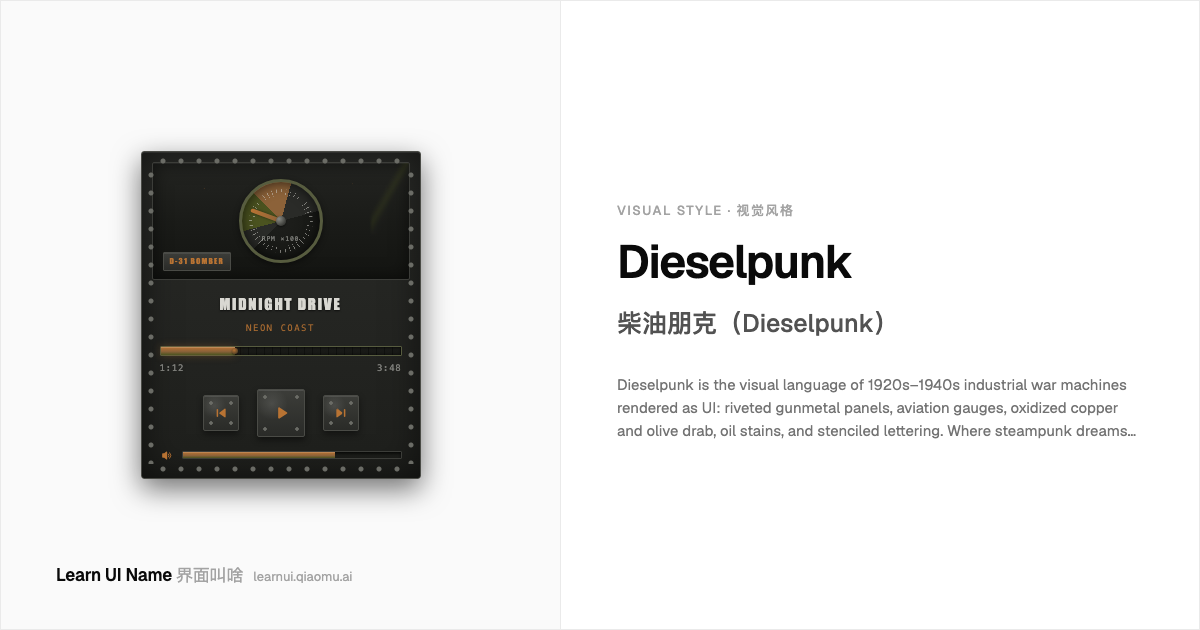
Dieselpunk 柴油朋克(Dieselpunk)
Dieselpunk is the visual language of 1920s–1940s industrial war machines rendered as UI: riveted gunmetal panels, aviation gauges, oxidized copper and olive drab, oil stains, and stenciled lettering. Where steampunk dreams of brass gentlemen and clockwork wonder, dieselpunk wakes up in a sooty hangar full of propellers, diesel exhaust, and Art Deco machinery. It is darker, heavier, and more militaristic — the aesthetic of function pushed to the edge of romance.
柴油朋克是把 1920–1940 年代的工业战争机器翻译成 UI 的视觉语言:铆接的暗金属面板、航空仪表、氧化铜与橄榄绿、油渍,以及喷印字体。如果说蒸汽朋克梦见黄铜绅士与发条奇迹,柴油朋克则醒来时身处满是螺旋桨、柴油废气与 Art Deco 机械的煤灰机库。它更暗、更重、更军事化——是把功能推到浪漫主义边缘的美学。
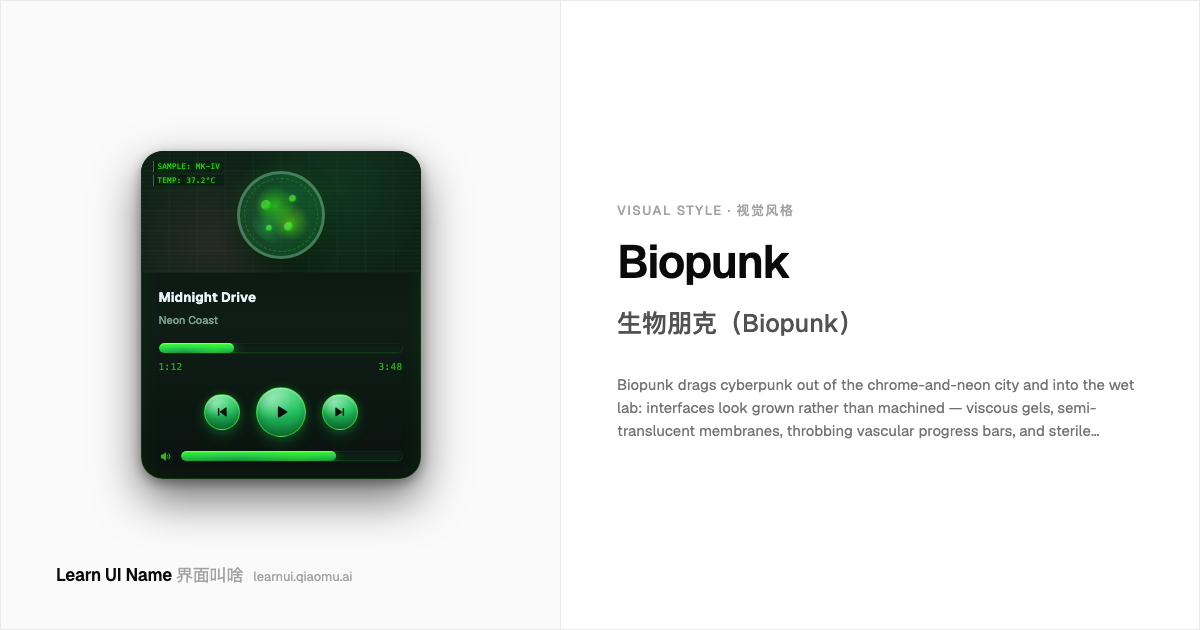
Biopunk 生物朋克(Biopunk)
Biopunk drags cyberpunk out of the chrome-and-neon city and into the wet lab: interfaces look grown rather than machined — viscous gels, semi-translucent membranes, throbbing vascular progress bars, and sterile medical readouts tinted in sickly greens, bruised pinks, and cold laboratory whites. It is the visual language of gene editing, biohacked implants, and cultures bubbling in petri dishes. Where cyberpunk asks 'what if the network owns you', biopunk asks 'what if your own cells do'.
生物朋克把赛博朋克从铬合金与霓虹灯的城市拖进湿件实验室:界面看起来是「长」出来的,而不是加工出来的——黏稠的凝胶、半透明的薄膜、像血管一样搏动的进度条,以及带着病态绿、瘀青粉和冰冷实验室白的无菌医疗读数。它是基因编辑、生物改造植入物和培养皿里冒泡菌落的视觉语言。赛博朋克问的是「如果网络拥有了你」,生物朋克问的是「如果你的细胞拥有你」。
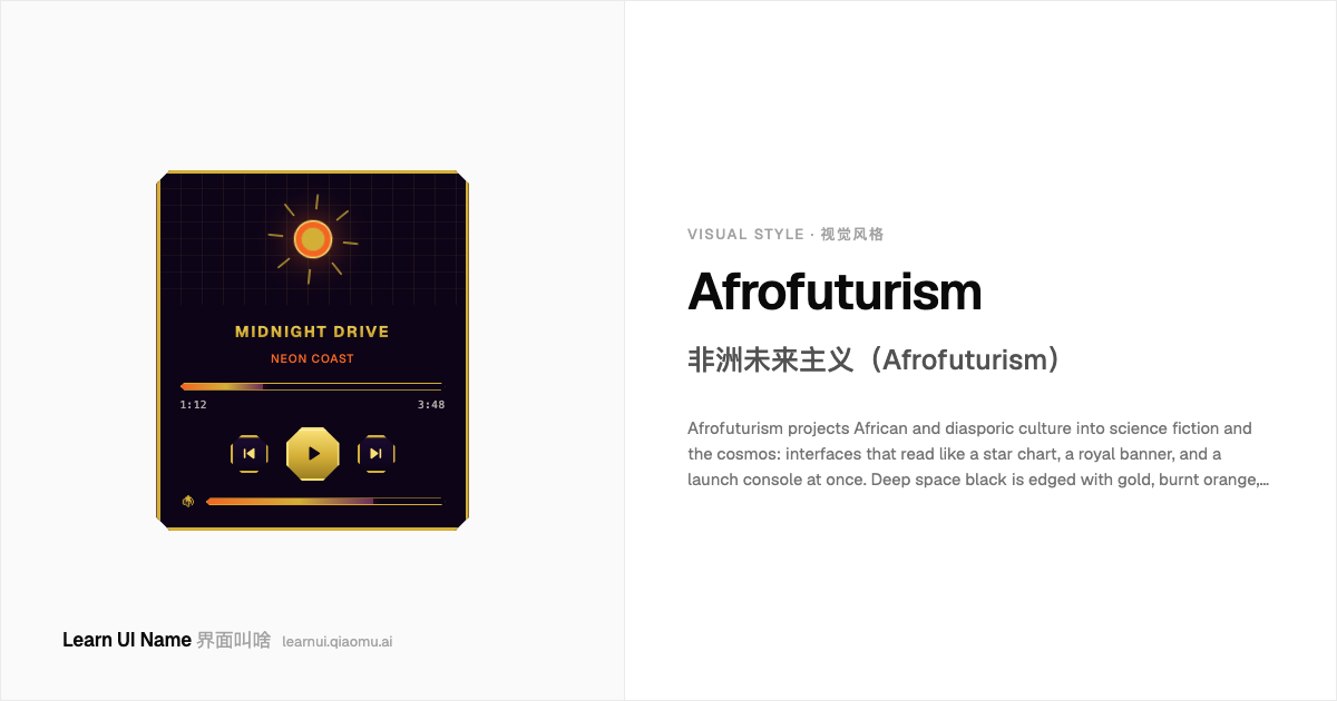
Afrofuturism 非洲未来主义(Afrofuturism)
Afrofuturism projects African and diasporic culture into science fiction and the cosmos: interfaces that read like a star chart, a royal banner, and a launch console at once. Deep space black is edged with gold, burnt orange, and royal purple; African geometric patterns frame sunbursts and constellations instead of neoclassical ornament. It has traveled from Sun Ra's cosmic jazz to the Wakandan UI of Black Panther.
非洲未来主义把非洲与非裔离散文化投射进科幻与宇宙:界面同时读起来像星图、皇室旗帜与发射控制台。深空黑镶着金、焦橙与皇室紫;非洲几何纹样框住日轮与星座,取代新古典装饰。它从 Sun Ra 的宇宙爵士一路走来,直到《黑豹》的瓦坎达 UI。
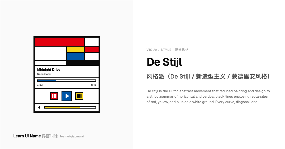
De Stijl 风格派(De Stijl / 新造型主义 / 蒙德里安风格)
De Stijl is the Dutch abstract movement that reduced painting and design to a strict grammar of horizontal and vertical black lines enclosing rectangles of red, yellow, and blue on a white ground. Every curve, diagonal, and representational reference is rejected; balance is achieved asymmetrically by shifting the weight of color blocks across an invisible orthogonal grid. The look is inseparable from Piet Mondrian's mature Neo-Plasticist canvases and from Theo van Doesburg's magazine and architectural projects of 1917–1931.
风格派(De Stijl)是一场荷兰抽象运动,把绘画与设计压缩成一套严格语法:水平与垂直的黑线框住白色底上的红、黄、蓝矩形。一切曲线、对角线、再现性参照都被排除;平衡靠色块在隐形正交网格上的非对称位移来实现。这种外观与 Piet Mondrian 成熟的新造型主义画布,以及 Theo van Doesburg 在 1917–1931 年间的杂志与建筑项目密不可分。
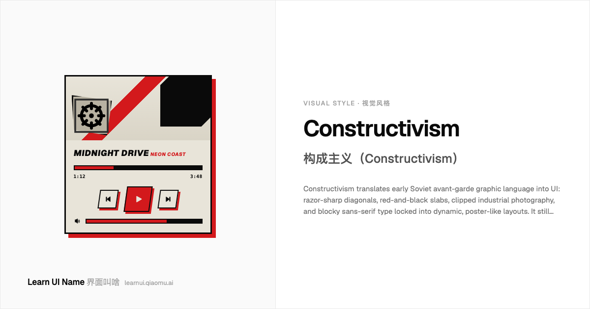
Constructivism 构成主义(Constructivism)
Constructivism translates early Soviet avant-garde graphic language into UI: razor-sharp diagonals, red-and-black slabs, clipped industrial photography, and blocky sans-serif type locked into dynamic, poster-like layouts. It still reads as propaganda energy rather than decoration — every element looks arranged to shout a message across a noisy square. A modern app borrowing the look usually wants urgency, solidarity, or editorial punch.
构成主义把早期苏联先锋派的图形语言转译成 UI:锐利的对角线、红黑块面、裁剪过的工业照片,以及被锁定在动态海报式排版中的粗黑无衬线字体。它读起来仍然是一种宣传能量,而不是装饰 —— 每个元素都像是在嘈杂广场上高声喊话。现代 App 借用这种外观,通常是为了传递紧迫感、集体感或编辑式冲击力。
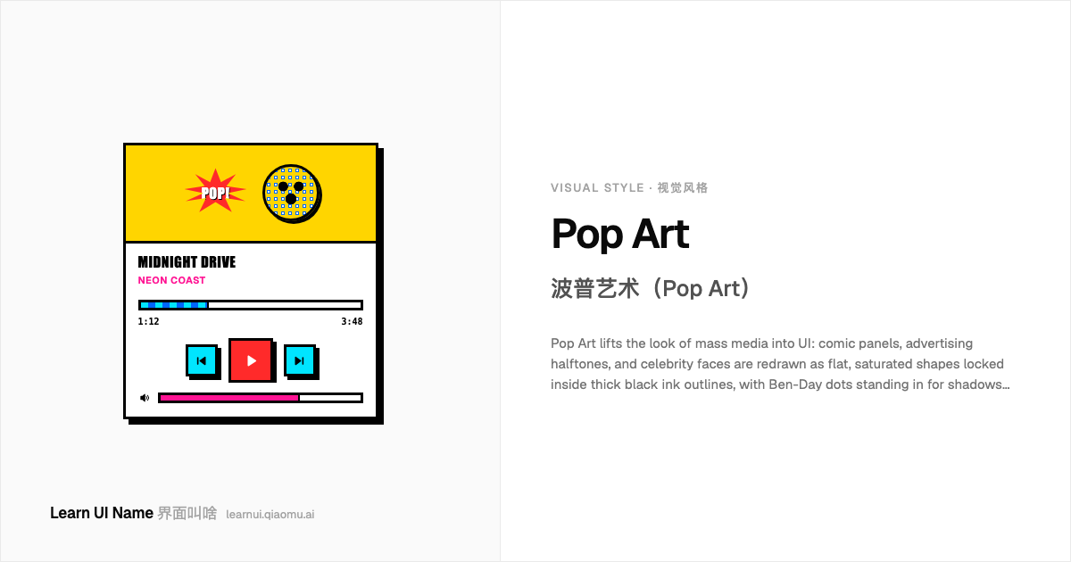
Pop Art 波普艺术(Pop Art)
Pop Art lifts the look of mass media into UI: comic panels, advertising halftones, and celebrity faces are redrawn as flat, saturated shapes locked inside thick black ink outlines, with Ben-Day dots standing in for shadows and gradients. It treats consumer culture as both subject and punchline — a soup can, a comic strip, a Marilyn — rendered in the primary-plus-neon palette of 1960s printing. The style is instantly readable because it borrows from the most familiar visual language on the newsstand.
波普艺术把大众媒体的视觉语言搬进 UI:漫画分格、广告网点、名人面孔被重绘成饱和的扁平色块,圈在粗黑墨线轮廓里,本戴网点替代阴影和渐变。它把消费文化同时当作主题和笑点——一罐汤、一格漫画、一张玛丽莲——用 1960 年代印刷品那种原色加霓虹的配色来呈现。这种风格一眼就能读懂,因为它借用了报刊亭上最熟悉的视觉语言。
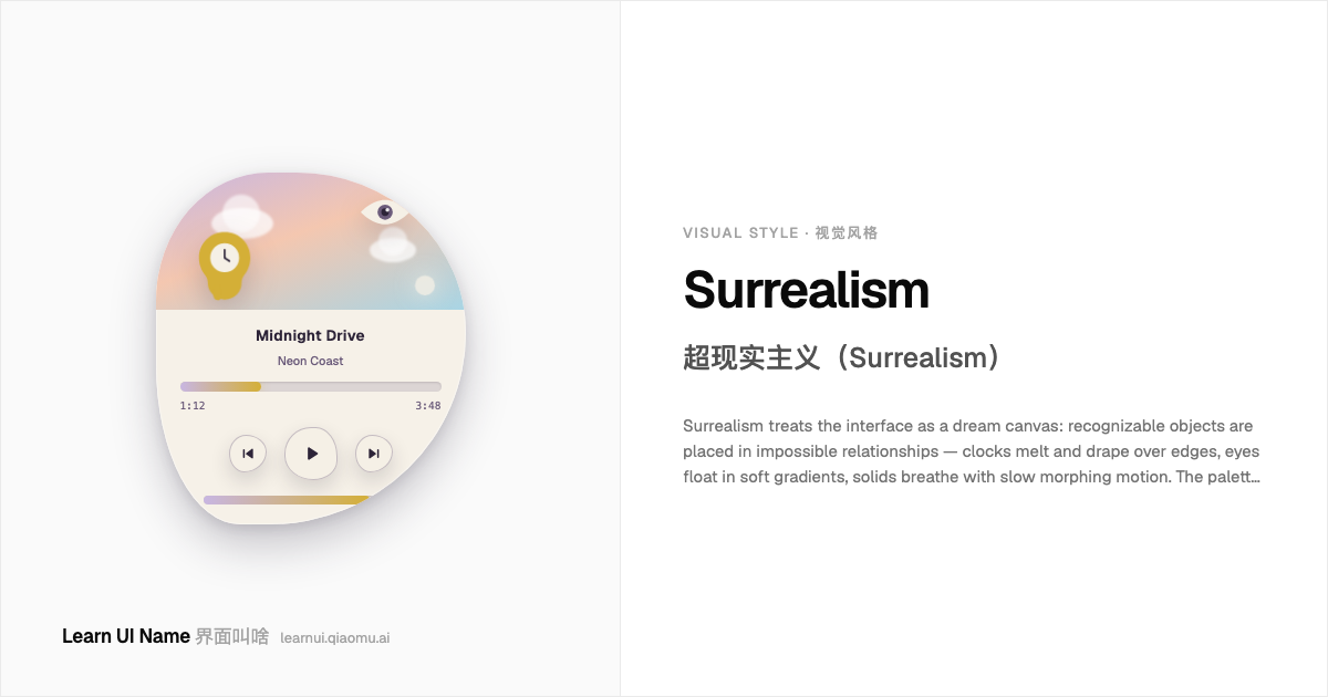
Surrealism 超现实主义(Surrealism)
Surrealism treats the interface as a dream canvas: recognizable objects are placed in impossible relationships — clocks melt and drape over edges, eyes float in soft gradients, solids breathe with slow morphing motion. The palette is hushed and lunar rather than neon, the lighting is diffuse and uncanny, and the composition follows the logic of the subconscious rather than the grid. It borrows its name from the 1924 art movement, but as a UI style it is a contemporary mood: the screen as a lucid dream.
超现实主义把界面当作梦境画布:可辨识的物件被放进不可能的关系里——时钟融化并垂挂在边缘,眼睛漂浮在柔渐变中,实体随着缓慢的形变动画呼吸。配色是低沉而月光的,而非霓虹;光线弥漫而诡异,构图遵循潜意识逻辑,而不是网格。名字借自 1924 年的艺术运动,但作为 UI 风格它是一种当代情绪:屏幕即清醒梦。
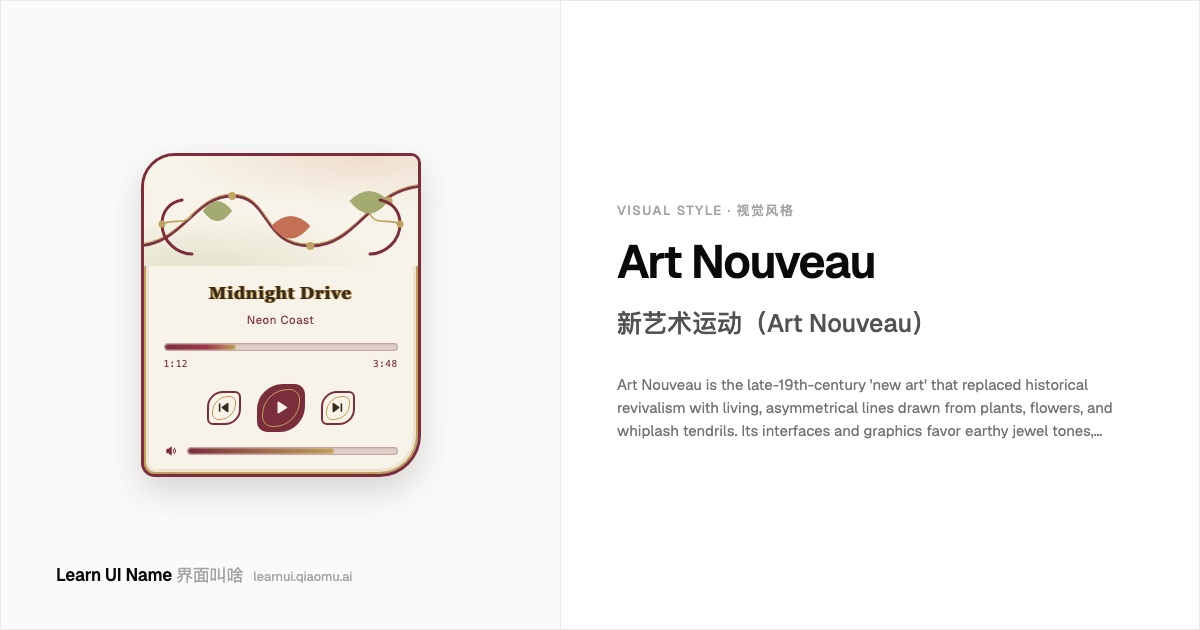
Art Nouveau 新艺术运动(Art Nouveau)
Art Nouveau is the late-19th-century 'new art' that replaced historical revivalism with living, asymmetrical lines drawn from plants, flowers, and whiplash tendrils. Its interfaces and graphics favor earthy jewel tones, oxidized gold, hand-drawn vines, and ornate serif lettering that seems to grow out of the page rather than sit on it. It flourished from roughly 1890 to 1910 and was eclipsed by the machine geometry of Art Deco.
新艺术运动是 19 世纪末的「新艺术」,它用从植物、花朵和鞭状卷须中抽出的、有生命力的不对称线条,取代了历史复兴主义。它的界面与图形偏爱土色宝石调、氧化金、手绘藤蔓,以及像从页面里长出来而非贴在上面的华丽衬线字体。它大约兴盛于 1890 至 1910 年间,随后被装饰艺术(Art Deco)的机器几何所取代。
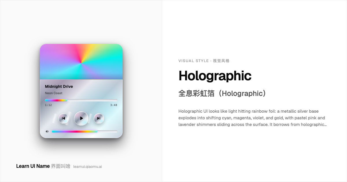
Holographic 全息彩虹箔(Holographic)
Holographic UI looks like light hitting rainbow foil: a metallic silver base explodes into shifting cyan, magenta, violet, and gold, with pastel pink and lavender shimmers sliding across the surface. It borrows from holographic foil printing and oil-slick diffraction, not glass or depth — the effect is flat, reflective, and synthetic. The style became the face of late-2010s unicorn branding, beauty-tech packaging, and year-in-review campaigns that wanted to feel futuristic and celebratory.
全息 UI 看起来像光打在彩虹箔上:金属银底会迸发出青、品红、紫、金等光谱色,粉彩的粉与薰衣草紫 shimmer 在表面滑动。它借自全息烫印和油渍衍射,而不是玻璃或纵深——效果是平面的、反射性的、合成的。这种外观成了 2010 年代末独角兽品牌、美妆科技和年度回顾视觉的招牌:既未来又喜庆。
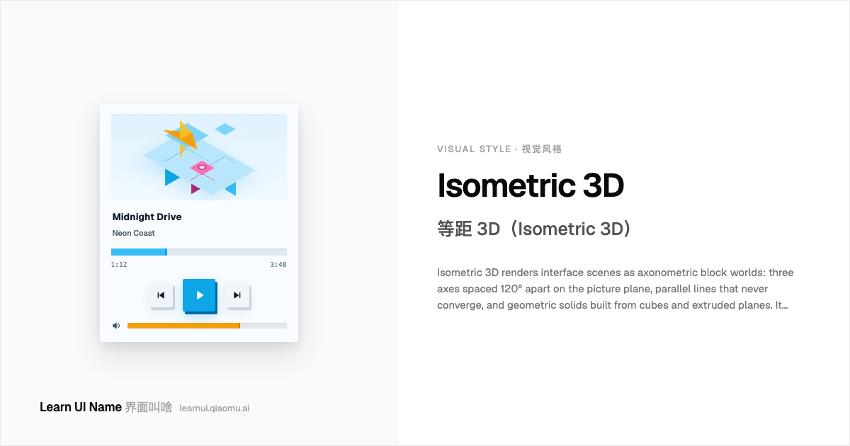
Isometric 3D 等距 3D(Isometric 3D)
Isometric 3D renders interface scenes as axonometric block worlds: three axes spaced 120° apart on the picture plane, parallel lines that never converge, and geometric solids built from cubes and extruded planes. It gives depth without perspective distortion, so a dashboard, city, or device cluster reads like a clean architectural model. The look surged in web illustration around 2017–2019 as 'isometric flat design' and remains a go-to language for explaining complex systems at a glance.
等距 3D 把界面场景渲染成轴测方块世界:三条轴线在平面上相隔 120°,平行线永不相交,形体由立方体和拉伸平面构成的干净几何体组成。它在没有透视变形的前提下制造纵深感,让仪表盘、城市或设备集群读起来像一幅整洁的建筑模型。这种观感在 2017–2019 年以「等距扁平风」(isometric flat design)的名义在网页插画里爆发,至今仍是把复杂系统一眼讲清楚的首选视觉语言。
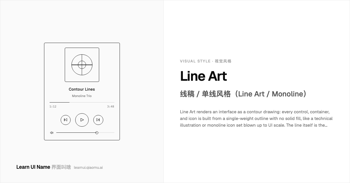
Line Art 线稿 / 单线风格(Line Art / Monoline)
Line Art renders an interface as a contour drawing: every control, container, and icon is built from a single-weight outline with no solid fill, like a technical illustration or monoline icon set blown up to UI scale. The line itself is the visual subject — not a border around a colored block, not decoration on top of a flat layout. It reads as precise, light, and almost schematic, as though the product were still a clean ink drawing on tracing paper.
线稿风格把界面画成一幅轮廓图:每一个控件、容器和图标都由单一粗细的轮廓线构成,没有实心填充,就像被放大到 UI 尺寸的单线图标集或技术插图。线本身就是视觉主体 —— 它不是色块周围的边框,也不是扁平布局上的装饰。整体观感精确、轻盈、近乎示意图,仿佛产品还是描图纸上一张干净的墨线图。
Hand-drawn / Doodle 手绘涂鸦(Hand-drawn / Doodle)
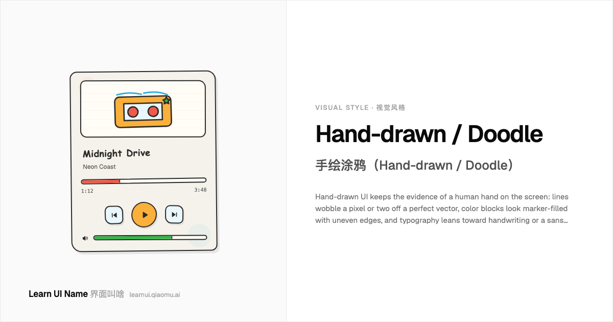
Hand-drawn UI keeps the evidence of a human hand on the screen: lines wobble a pixel or two off a perfect vector, color blocks look marker-filled with uneven edges, and typography leans toward handwriting or a sans softened by slight rotation. It signals low-fi honesty, playfulness, or a deliberate escape from polished SaaS sameness. The look lives in sketchy wireframes, indie app onboarding, and landing pages that want to feel like a notebook rather than a dashboard.
手绘涂鸦 UI 把「人手的痕迹」留在屏幕上:线条会比完美矢量偏出去 1–2px,色块像马克笔涂过一样边缘不均,字体则偏向手写体,或者把无衬线体微微旋转、软化。它传递低保真、真诚或玩心的信号,是有意逃离 polished SaaS 千篇一律感的选择。这种外观常见于 sketchy 线框图、独立 App 的引导页,以及希望像笔记本而非仪表盘的落地页。
Fantasy RPG UI 奇幻 RPG 界面(Fantasy RPG UI)
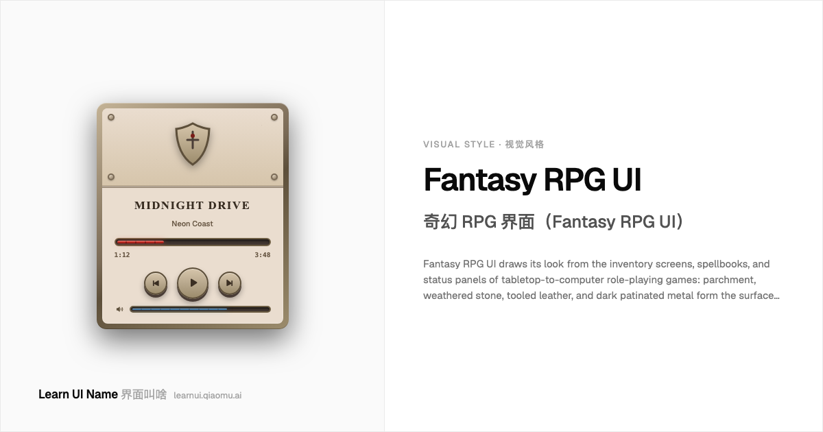
Fantasy RPG UI draws its look from the inventory screens, spellbooks, and status panels of tabletop-to-computer role-playing games: parchment, weathered stone, tooled leather, and dark patinated metal form the surfaces; runic or blackletter-inflected type announces headings; red health and blue mana bars wrap the action in resource drama. The style treats the screen as a physical artifact from a medieval-fantasy world, not as a flat display. It crystallized in early CRPGs and was polished into a convention by the MMO era, then surfaced again in every indie dungeon crawler and gacha RPG.
奇幻 RPG 界面的观感取自桌上角色扮演游戏转化而来的电脑 RPG 的背包、法术书和状态面板:羊皮纸、风化石材、压花皮革和深色氧化金属构成表面;符文或哥特黑体字标题宣告身份;红色生命条与蓝色法力条把资源张力包进画面。这个风格把屏幕当作中世纪奇幻世界的实体遗物,而非一块扁平显示屏。它在早期电脑 RPG 中成型,经 MMO 时代打磨成惯例,又在每一款独立地牢探险和抽卡 RPG 中回潮。
LCARS LCARS(图书馆计算机访问/检索系统)
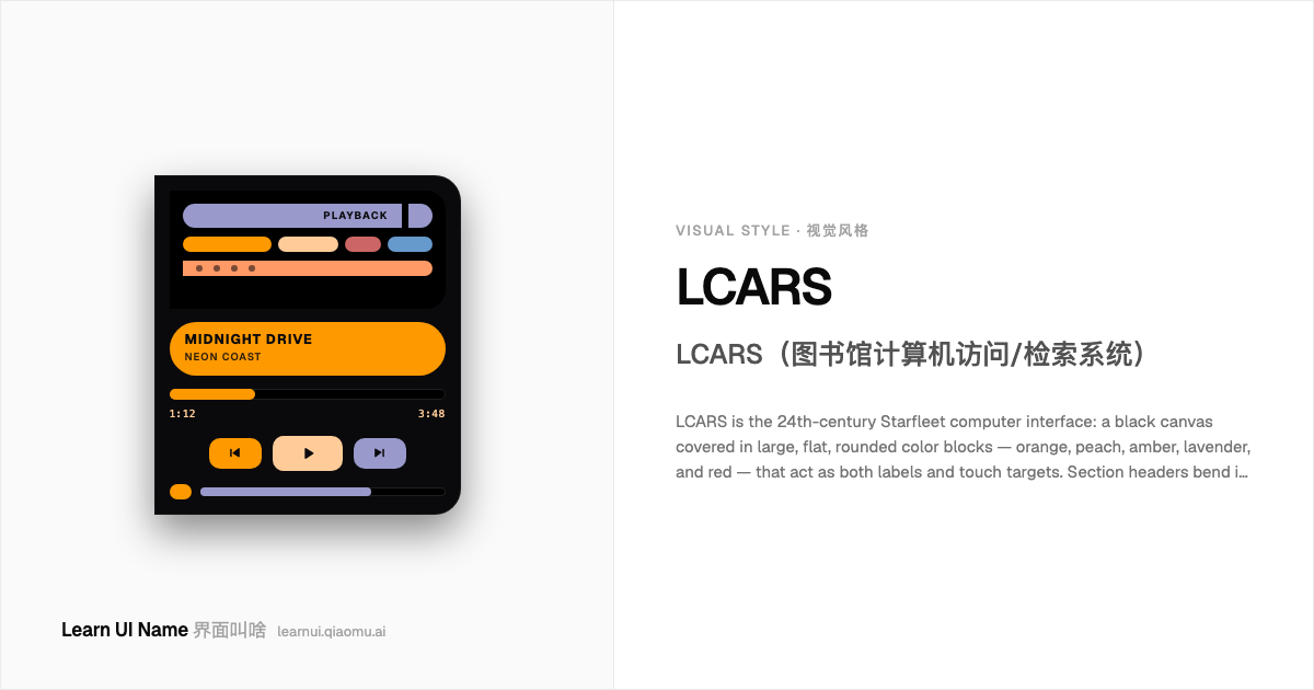
LCARS is the 24th-century Starfleet computer interface: a black canvas covered in large, flat, rounded color blocks — orange, peach, amber, lavender, and red — that act as both labels and touch targets. Section headers bend in curved "elbow" or boomerang shapes, text is almost always uppercase sans-serif, and the whole thing reads as an illuminated console rather than a windowed desktop. It was created for Star Trek: The Next Generation in 1987 and remains the visual shorthand for friendly, accessible sci-fi ship controls.
LCARS 是 24 世纪星际舰队计算机界面的视觉语言:一块黑色画布上铺着大片扁平的圆角色块——橙、桃、琥珀、薰衣草紫和红色——这些色块同时充当标签和触控目标。区块标题会弯成「弯头」或回旋镖形状,文字几乎全是带衬线体以外的无衬线大写,整体读起来像一块发光的控制台,而不是窗口化桌面。它诞生于 1987 年的《星际迷航:下一代》,至今仍是友好、易用型科幻飞船控制界面的视觉代名词。
Solarpunk 太阳朋克(Solarpunk)
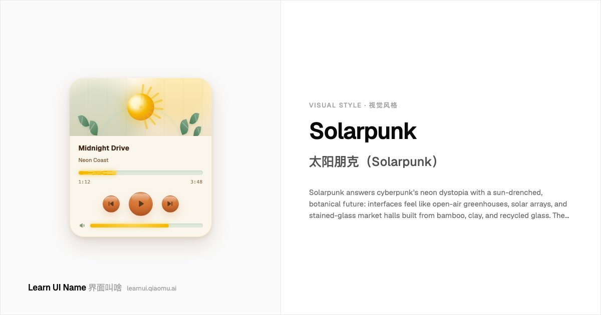
Solarpunk answers cyberpunk's neon dystopia with a sun-drenched, botanical future: interfaces feel like open-air greenhouses, solar arrays, and stained-glass market halls built from bamboo, clay, and recycled glass. The palette leans on warm terracotta, sage green, solar gold, sky cyan, and cream; geometry borrows from Art Nouveau vines, Islamic tilework, and hexagonal solar cells rather than hard chrome grids. It is optimistic infrastructure made visible — wind turbines, leaves, sun rays, and water channels rendered as decorative but functional UI patterns.
太阳朋克用阳光浸透、植物繁茂的未来回应赛博朋克的霓虹反乌托邦:界面感觉像开放式温室、太阳能阵列,以及由竹子、黏土和再生玻璃建成的彩色玻璃市集大厅。配色偏向暖陶土色、鼠尾草绿、太阳能金、天空青和奶油白;几何语言借鉴新艺术风格的藤蔓、伊斯兰瓷砖纹样和六边形太阳能电池,而非硬朗的铬合金网格。它让乐观的基础设施变得可见——风车、叶片、阳光和水渠被渲染成装饰性的功能 UI 图案。
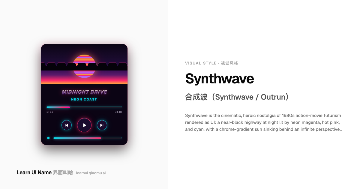
Synthwave 合成波(Synthwave / Outrun)
Synthwave is the cinematic, heroic nostalgia of 1980s action-movie futurism rendered as UI: a near-black highway at night lit by neon magenta, hot pink, and cyan, with a chrome-gradient sun sinking behind an infinite perspective grid. Where vaporwave remixes the 80s as an ironic, decayed collage, synthwave plays it straight — glossy, driving, and soundtrack-ready. It borrows its palette from arcade marquees and movie posters, then polishes it into sunset gradients, mirrored chrome type, and glowing grid floors.
合成波是把 80 年代动作片未来主义渲染成 UI 的、充满电影感的英雄式怀旧:一条深夜公路,被霓虹品红、热粉和青色照亮,镀铬渐变的夕阳沉在无限延伸的透视网格后方。蒸汽波把 80 年代 remix 成讽刺、磨损的拼贴,合成波却把它演得正正经经 —— 光泽、推进感、像配乐已经响起来。它的配色借自街机招牌和电影海报,再被抛光成日落渐变、镜面铬字和发光的网格地面。
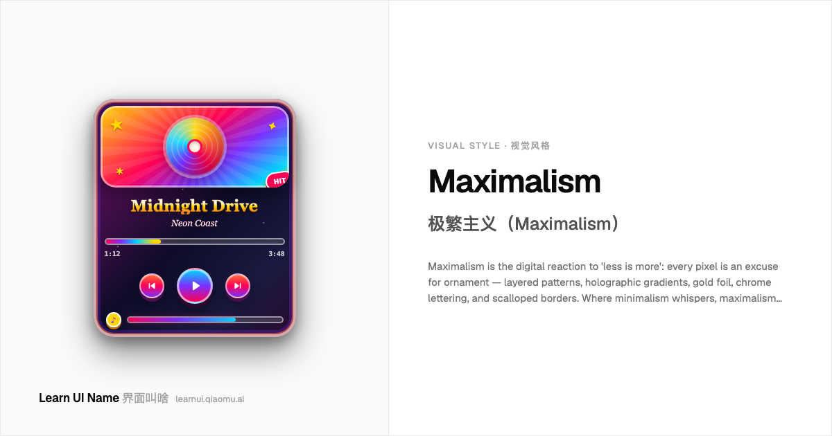
Maximalism 极繁主义(Maximalism)
Maximalism is the digital reaction to 'less is more': every pixel is an excuse for ornament — layered patterns, holographic gradients, gold foil, chrome lettering, and scalloped borders. Where minimalism whispers, maximalism shouts in four fonts at once. The style is lush, crafted, and intentionally excessive, yet the chaos is composed: buttons still look clickable and the palette stays coordinated. It flourishes in editorial, fashion, and event screens that want to feel like a jewel box.
极繁主义是数字界面对「少即是多」的反动:每一寸像素都成了装饰的借口 —— 层叠图案、全息渐变、金箔、铬色字体、扇贝形边框。极简主义低语的地方,极繁主义同时用四种字体大喊。这个风格华丽、考究、故意过度,但混乱受控:按钮依旧可点,配色即使喧闹也是协调的。它在编辑、时尚和活动类屏幕上蓬勃生长,让自己看起来像珠宝盒。
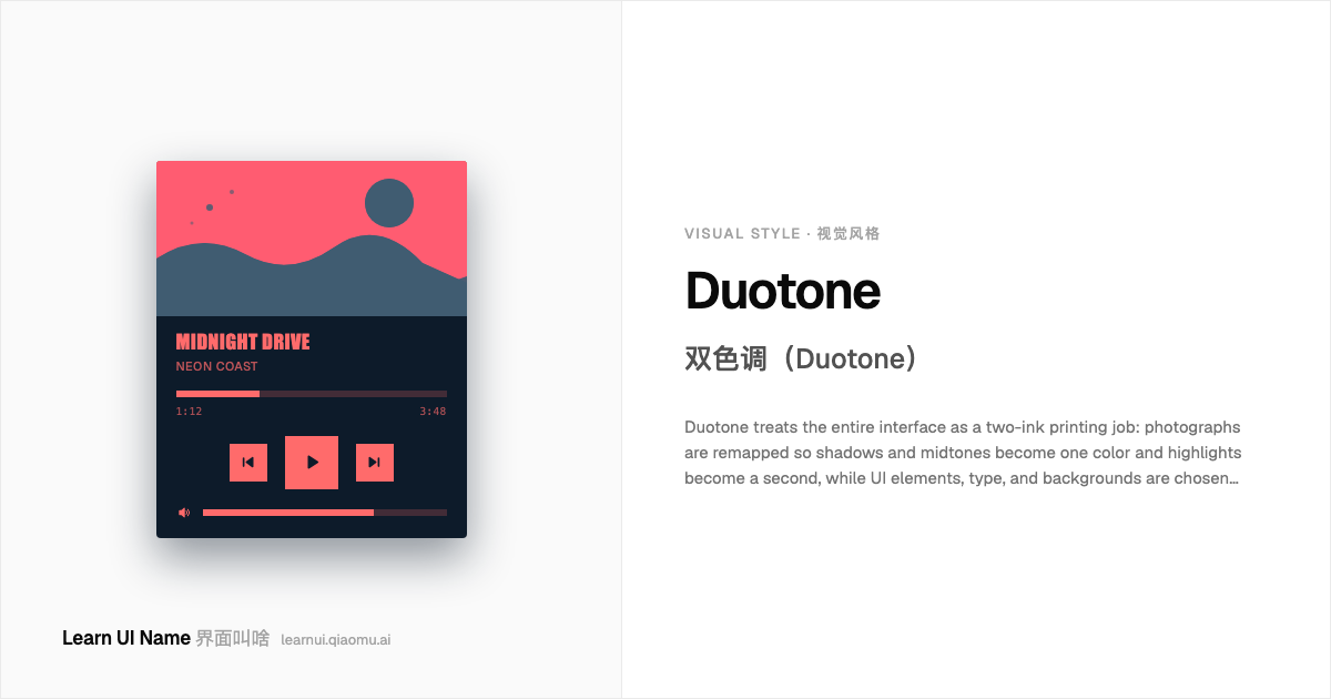
Duotone 双色调(Duotone)
Duotone treats the entire interface as a two-ink printing job: photographs are remapped so shadows and midtones become one color and highlights become a second, while UI elements, type, and backgrounds are chosen from the same pair. The result is loud but controlled — a portrait, a product shot, or an album cover reduced to a high-contrast silhouette in, say, deep indigo and hot coral. It borrows from pre-digital commercial printing, but became a dominant web and app look in the mid-2010s when streaming and editorial brands used it to unify disparate photography into one graphic system.
双色调把整个界面当作两色印刷品来处理:照片被重新映射,阴影和中调变成一种颜色,高光变成第二种颜色,而 UI 元素、文字和背景也都从这对颜色里选取。最终效果响亮但受控——一张肖像、产品照或专辑封面被简化成深靛蓝加热珊瑚色的高对比剪影。它借用了前数字时代的商业印刷语言,但在 2010 年代中期成为主流网页和应用风格,当时流媒体和编辑品牌用它把纷繁的摄影素材统一进同一个视觉系统。
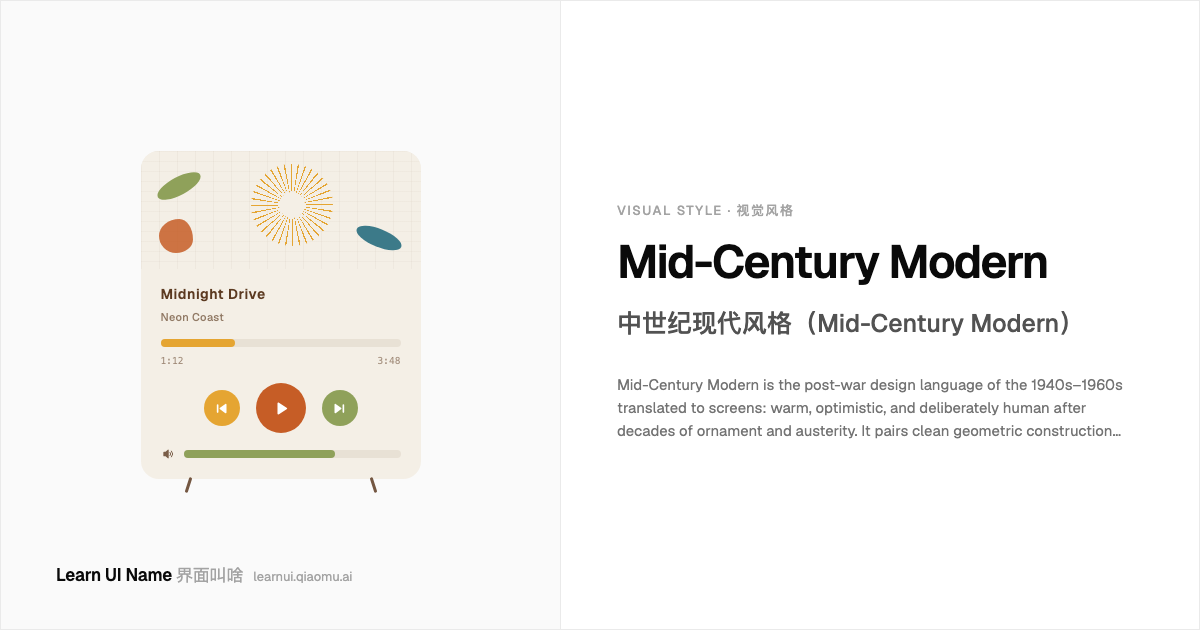
Mid-Century Modern 中世纪现代风格(Mid-Century Modern)
Mid-Century Modern is the post-war design language of the 1940s–1960s translated to screens: warm, optimistic, and deliberately human after decades of ornament and austerity. It pairs clean geometric construction with organic boomerang-and-starburst shapes, sets them on walnut-and-cream grounds with mustard, avocado, burnt orange and teal accents, and holds the layout in asymmetrical balance rather than mirror symmetry. The type is a friendly geometric sans — Futura, Avant Garde, Century Gothic — with medium weight and airy spacing, never gilded all-caps. Revived constantly for lifestyle brands and editorial UI, it reads like a well-designed living room: ordered but never cold.
中世纪现代风格是把 1940–1960 年代战后设计语言搬到屏幕上:在过度装饰与紧缩之后,它温暖、乐观、刻意保持人情味。它把干净的几何构造和有机的回旋镖、星爆形结合在一起,放在胡桃木与奶咖底色上,点缀芥末黄、牛油果绿、焦橙和蓝绿色,并用非对称平衡而非镜像对称来组织版面。字体是友好的几何无衬线 —— Futura、Avant Garde、Century Gothic —— 中等字重、宽松的间距,绝不是镀金全大写。它常被生活方式品牌和编辑式 UI 复兴,读起来像一间设计精良的客厅:有序,但不冷。
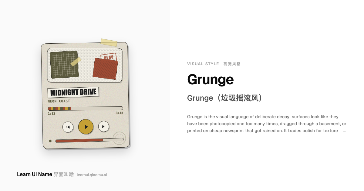
Grunge Grunge(垃圾摇滚风)
Grunge is the visual language of deliberate decay: surfaces look like they have been photocopied one too many times, dragged through a basement, or printed on cheap newsprint that got rained on. It trades polish for texture — xerox grain, scratches, coffee stains, torn paper, smudged ink, and a palette of dirty olives, rust, mustard, and faded blacks. Unlike a clean retro look, grunge keeps the dirt as decoration; it flourishes in music packaging, zine sites, alternative editorial, and any interface that wants to feel handmade, lived-in, and slightly broken.
Grunge 是刻意衰败的视觉语言:表面看起来像是被多复印了一次的传单、在地下室里拖过、或是印在 cheap newsprint 上又被雨淋过。它用质感交换精致——复印颗粒、划痕、咖啡渍、撕纸、晕染的墨,以及脏橄榄、铁锈、芥末和褪色的黑。和干净的复古风不同,grunge 把污垢本身当作装饰;它在音乐包装、独立杂志风网站、另类编辑设计,以及任何想让人觉得手工、用过、有点破损的界面里生长。
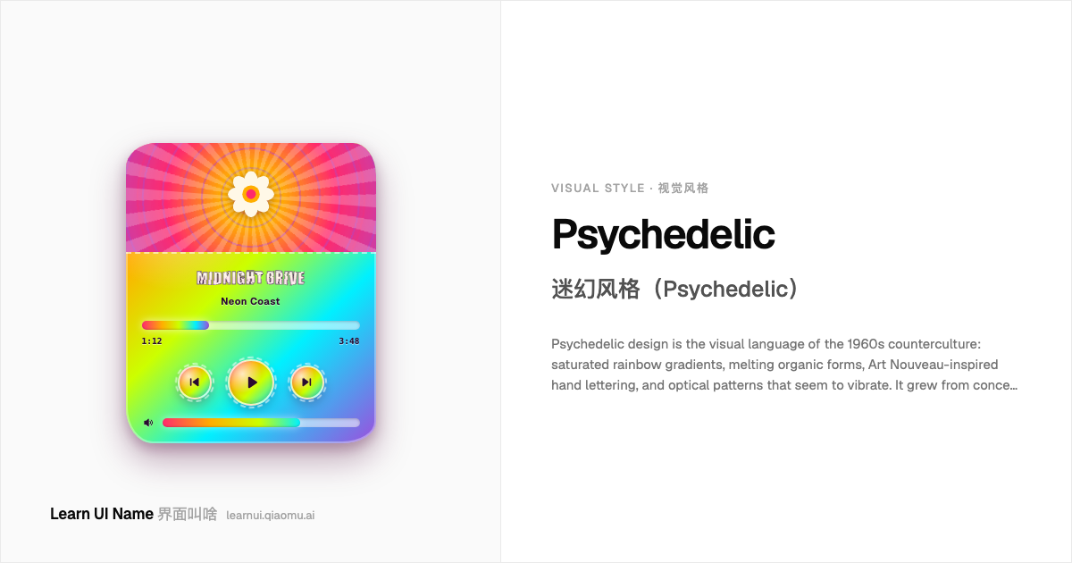
Psychedelic 迷幻风格(Psychedelic)
Psychedelic design is the visual language of the 1960s counterculture: saturated rainbow gradients, melting organic forms, Art Nouveau-inspired hand lettering, and optical patterns that seem to vibrate. It grew from concert posters for rock bands like the Grateful Dead and Jefferson Airplane, where artists borrowed Eastern mandalas, paisley, flower-power flora, and whiplash curves to evoke altered perception. The palette is bright and unapologetic - hot pinks, oranges, violets, and lime greens in flowing washes - and the mood is utopian, mystical, and handmade rather than dark or digital.
迷幻风格是 1960 年代反主流文化的视觉语言:饱和的彩虹渐变、融化的有机形态、受新艺术运动启发的手绘字体,以及看起来仿佛在振动的视错觉图案。它起源于 Grateful Dead、Jefferson Airplane 等摇滚乐队的演唱会海报,艺术家们借用东方曼陀罗、佩斯利花纹、花之力植物图案和鞭形曲线来唤起 altered perception。配色明亮而毫不妥协——热粉、橙、紫罗兰和青柠绿在流动的水洗色中层层叠加——整体气质是乌托邦式的、神秘的、手工艺的,而非黑暗或数字感的。
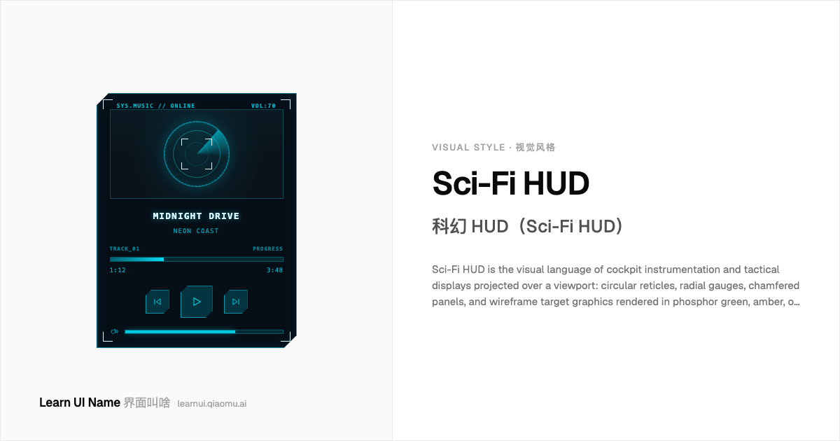
Sci-Fi HUD 科幻 HUD(Sci-Fi HUD)
Sci-Fi HUD is the visual language of cockpit instrumentation and tactical displays projected over a viewport: circular reticles, radial gauges, chamfered panels, and wireframe target graphics rendered in phosphor green, amber, or cyan over a dark canvas. Where cyberpunk borrows from neon city streets, sci-fi HUD borrows from aviation, spaceflight, and military targeting systems — the goal is readable instrumentation, not urban atmosphere. It turns a UI into a heads-up display that feels scanned, locked, and mission-critical.
科幻 HUD 是驾驶舱仪表与战术显示屏投射在视野上的视觉语言:圆形瞄准具、径向仪表、切角面板,以及用磷光绿、琥珀或青色渲染在深色画布上的线框目标图形。如果说赛博朋克借的是霓虹街道,科幻 HUD 借的就是航空、航天和军事瞄准系统——目标的是可读仪器感,而不是都市氛围。它把 UI 变成一块抬头显示,让人觉得信息正被扫描、锁定,并且事关任务成败。
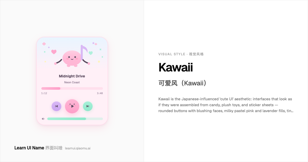
Kawaii 可爱风(Kawaii)
Kawaii is the Japanese-influenced 'cute UI' aesthetic: interfaces that look as if they were assembled from candy, plush toys, and sticker sheets — rounded buttons with blushing faces, milky pastel pink and lavender fills, tiny hearts and stars scattered as decoration, and every icon given a friendly anthropomorphic twist. It migrated from Sanrio stationery and LINE sticker culture into product UI during the 2010s, where it signals innocence, playfulness, and emotional warmth rather than corporate efficiency.
可爱风(Kawaii)是受日本影响的「可爱 UI」美学:界面看起来像用糖果、毛绒玩具和贴纸拼成的 —— 圆角按钮长着红扑扑的脸蛋,填充着牛奶质感的柔粉和薰衣草紫,小星星和爱心作为装饰四处散落,每个图标都被赋予友好的拟人化处理。它从 Sanrio 文具和 LINE 贴图文化迁移到产品 UI,在 2010 年代走红,传递的是天真、 playful 和情感温度,而不是企业效率。
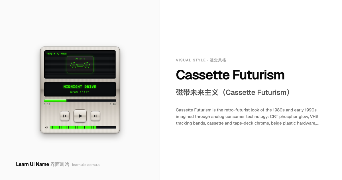
Cassette Futurism 磁带未来主义(Cassette Futurism)
Cassette Futurism is the retro-futurist look of the 1980s and early 1990s imagined through analog consumer technology: CRT phosphor glow, VHS tracking bands, cassette and tape-deck chrome, beige plastic hardware, wireframe vector graphics, and grid horizons rendered on blocky low-res screens. It is not the polished digital future of the 2000s; it is a future pieced together from cathode-ray tubes, audio tapes, and early computer GUIs — lo-fi, warm, and slightly degraded.
磁带未来主义是 1980 年代到 1990 年代初、透过模拟消费科技想象出来的复古未来主义视觉:CRT 荧光屏辉光、VHS 磁迹干扰带、磁带卡座的铬色、米色塑料机身、线框矢量网格,以及块状低分辨率屏幕上渲染的地平线。它不是 2000 年代那种打磨过的数字未来;它是用阴极射线管、录音带和早期电脑 GUI 拼凑出来的未来 —— 低保真、温暖、带着轻微磨损感。
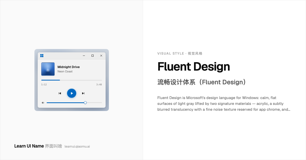
Fluent Designnew 流畅设计体系(Fluent Design)
Fluent Design is Microsoft's design language for Windows: calm, flat surfaces of light gray lifted by two signature materials — acrylic, a subtly blurred translucency with a fine noise texture reserved for app chrome, and mica, an opaque surface tinted once from the desktop wallpaper — plus soft depth shadows, 8px rounded corners, and one system accent color on an otherwise neutral palette. Announced at Build 2017 as Metro's successor, it matured into the quiet, layered look of Windows 11.
流畅设计体系(Fluent Design)是微软为 Windows 打造的设计语言:浅灰色的平静扁平表面,由两种招牌材质提亮 —— 亚克力(acrylic),一种带细腻噪点颗粒的轻模糊半透明,只留给应用外壳;云母(mica),一种只从桌面壁纸取一次色的不透明表面 —— 再加上柔和的纵深阴影、8px 圆角,以及中性配色之上唯一的系统强调色。2017 年在 Build 大会上作为 Metro 的继任者发布,在 Windows 11 里成熟为安静、分层的观感。
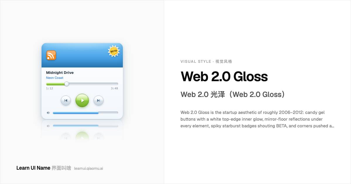
Web 2.0 Glossnew Web 2.0 光泽(Web 2.0 Gloss)
Web 2.0 Gloss is the startup aesthetic of roughly 2006–2012: candy gel buttons with a white top-edge inner glow, mirror-floor reflections under every element, spiky starburst badges shouting BETA, and corners pushed as round as the brand-new CSS3 border-radius allowed. Everything sits on a clean white page under bright, friendly gradients — lime, sky blue, sunny orange — with soft fuzzy shadows and Arial or Verdana type. The shine is synthetic and commercial: gloss as salesmanship, not nature.
Web 2.0 光泽是大约 2006–2012 年间的创业公司美学:糖果凝胶按钮顶部边缘一圈白色内发光,每个元素脚下踩着镜面地板倒影,带尖角的星形爆炸贴喊着 BETA,圆角推到当时刚诞生的 CSS3 border-radius 允许的极限。一切都摆在干净的白色页面上,配明亮友好的渐变——青柠、天蓝、阳光橙——加上柔和模糊的投影和 Arial 或 Verdana 字体。这种亮泽是人造的、商业的:光泽是推销术,不是大自然。
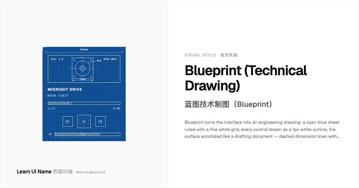
Blueprint (Technical Drawing)new 蓝图技术制图(Blueprint)
Blueprint turns the interface into an engineering drawing: a cyan-blue sheet ruled with a fine white grid, every control drawn as a 1px white outline, the surface annotated like a drafting document — dashed dimension lines with arrowheads, measurements ('280mm'), figure labels ('FIG. 1-A'), crosshair registration marks, and terse hand-lettered notes. Nothing is filled in; the UI is specified, not painted. It signals precision and planning — the screen as something you could build from.
蓝图把界面变成一张工程图纸:青蓝色图纸上打着细白网格,每个控件都画成 1px 白色轮廓线,图面像制图文件一样布满标注 —— 带箭头的虚线尺寸线、测量值('280mm')、图号标签('FIG. 1-A')、十字对位标记和简短的手写体注释。什么都不填色;UI 是被「标定」出来的,不是画出来的。它传达精确和规划感 —— 屏幕是一份可以照着施工的东西。
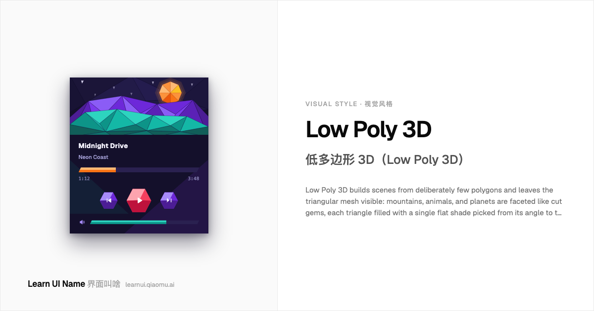
Low Poly 3Dnew 低多边形 3D(Low Poly 3D)
Low Poly 3D builds scenes from deliberately few polygons and leaves the triangular mesh visible: mountains, animals, and planets are faceted like cut gems, each triangle filled with a single flat shade picked from its angle to the light — no textures, no smooth gradients. The result is jewel-like, faceted lighting you could count by hand. Once a hardware limit of 1990s real-time 3D, it returned in the 2010s as a chosen aesthetic across indie games, wallpapers, and brand illustration.
低多边形 3D 用刻意稀少的多边形搭建场景,并让三角形网格赤裸可见:山峦、动物和星球都像切割过的宝石一样布满刻面,每个三角形只填一种纯色,色值取自它与光源的夹角 —— 没有贴图,没有平滑渐变。结果是一种可以用手指数过来的、宝石般的刻面光照。它曾经是 1990 年代实时 3D 的硬件极限,到了 2010 年代则作为一种主动选择的美学回归,遍布独立游戏、壁纸和品牌插画。
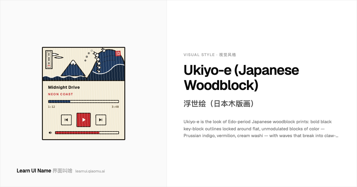
Ukiyo-e (Japanese Woodblock)new 浮世绘(日本木版画)
Ukiyo-e is the look of Edo-period Japanese woodblock prints: bold black key-block outlines locked around flat, unmodulated blocks of color — Prussian indigo, vermilion, cream washi — with waves that break into claw-like foam fingers, distant cone mountains, and clouds drawn as pattern rather than perspective. Registration is crisp and shading is nearly absent; prints carry vertical title cartouches and red hanko seals. Cheap mass media in its day, it now reads as instant classical Japan.
浮世绘是日本江户时代木版画的观感:粗黑的轮廓主线(key block)框住一块块扁平无调子的颜色 —— 普鲁士靛蓝、朱红、米色和纸 —— 海浪碎成爪子般的浪花指,远处是圆锥形的山,云被画成图案而不是透视。套色精准,几乎没有明暗渲染;画面上带竖排的标题框和红色印章。它在当年是廉价的大众媒体,如今一眼就是「古典日本」。
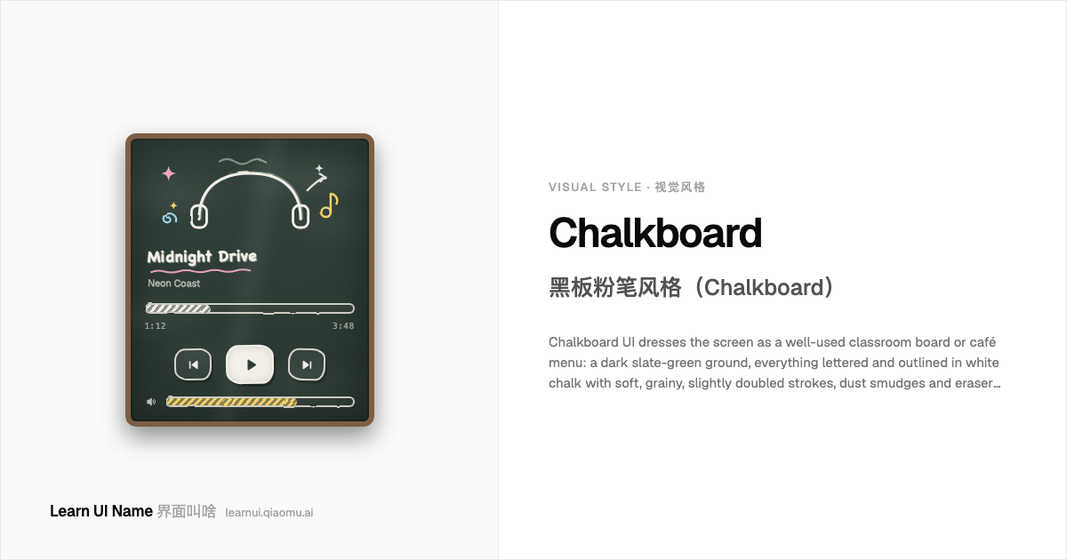
Chalkboardnew 黑板粉笔风格(Chalkboard)
Chalkboard UI dresses the screen as a well-used classroom board or café menu: a dark slate-green ground, everything lettered and outlined in white chalk with soft, grainy, slightly doubled strokes, dust smudges and eraser wipes left behind, and the odd pastel chalk accent in pink, yellow, or sky blue. Doodle stars, swirls, arrows, and wavy underlines finish the hand-lettered look. It trades polish for warmth — an analog, teacher-at-the-board signal.
黑板粉笔风格把界面扮成一块用久了的教室黑板或咖啡馆菜单板:深石板绿的底,所有字和轮廓都用白粉笔写出,笔画柔和、带颗粒、微微描着重影;板面上留着粉笔灰的涂抹和板擦擦过的痕迹,偶尔点缀粉色、黄色或天蓝的彩色粉笔。星星、螺旋、箭头和波浪下划线收尾,凑足手写板书的味道。它用精致换温度 —— 一种模拟的、老师站在黑板前的信号。
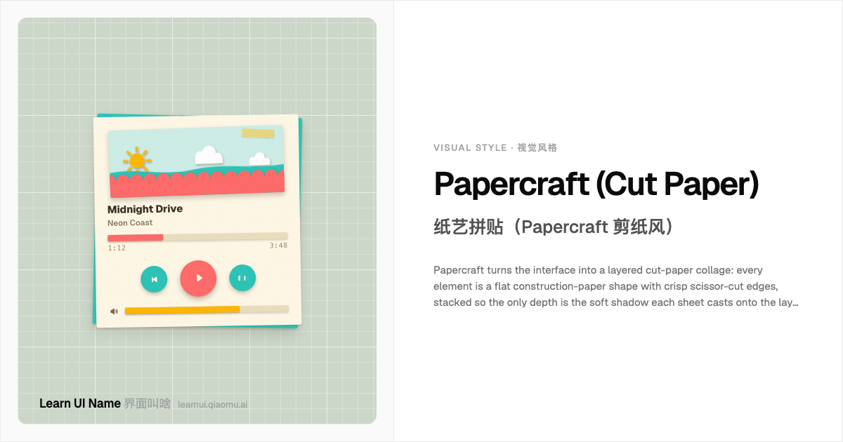
Papercraft (Cut Paper)new 纸艺拼贴(Papercraft 剪纸风)
Papercraft turns the interface into a layered cut-paper collage: every element is a flat construction-paper shape with crisp scissor-cut edges, stacked so the only depth is the soft shadow each sheet casts onto the layer beneath. Scalloped pinking-shear borders, torn strips, and paper grain sell the cardstock; a matte craft-store palette of coral, teal, and mustard on cream keeps it cheerful. It moved from children's-book illustration into indie games, apps, and sites that want to feel handmade.
纸艺拼贴把界面渲染成一幅多层剪纸拼贴画:每个元素都是一张扁平的彩色卡纸,边缘是利落的剪刀切口,层层叠放,唯一的纵深是每张纸投向下一层的柔和影子。花边剪裁出的锯齿边、手撕纸条和纸张纹理把「卡纸感」坐实,哑光的工艺店配色 —— 珊瑚红、青绿、芥末黄铺在奶油色底上 —— 保持明快。它从儿童绘本插画走进独立游戏、App 和想「像手做的」网站。
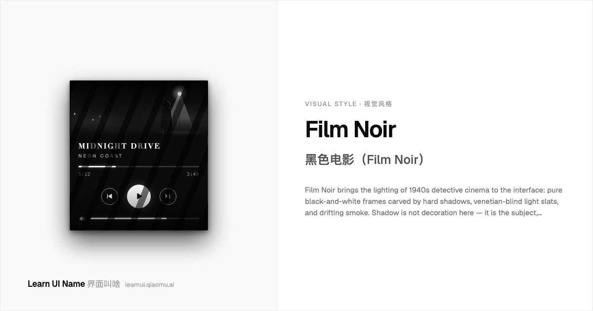
Film Noirnew 黑色电影(Film Noir)
Film Noir brings the lighting of 1940s detective cinema to the interface: pure black-and-white frames carved by hard shadows, venetian-blind light slats, and drifting smoke. Shadow is not decoration here — it is the subject, swallowing most of the canvas while one harsh source picks out a silhouette or a strip of pavement. On screens it surfaces in film-poster microsites and editorial features that want fatalistic, rain-slicked drama: extreme contrast, deep blacks, and not one drop of color.
黑色电影(Film Noir)把 1940 年代侦探片的打光搬进界面:纯黑白的画面被生硬的阴影、百叶窗投下的光栅和缓缓漂移的烟雾切割开。阴影在这里不是装饰 —— 它是主角,吞掉画面的大部分,只剩一道刺眼的硬光勾出一个剪影或一小段路面。在屏幕上,它出现在电影海报式微站和想要宿命感、雨夜戏剧张力的专题页里:极端对比、深黑,一滴颜色都不放。
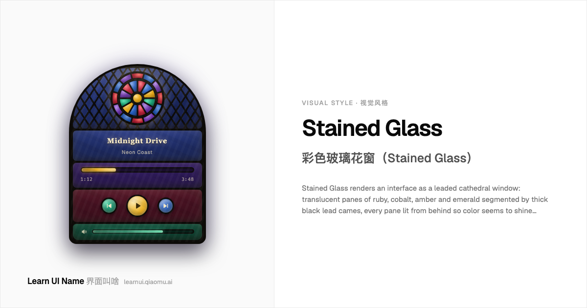
Stained Glassnew 彩色玻璃花窗(Stained Glass)
Stained Glass renders an interface as a leaded cathedral window: translucent panes of ruby, cobalt, amber and emerald segmented by thick black lead cames, every pane lit from behind so color seems to shine through the surface rather than sit on it. Motifs borrow the craft's vocabulary — rose windows, diamond quarrels, arched lights — and panes carry the streaks and seeded bubbles of hand-blown antique glass.
彩色玻璃花窗把界面渲染成一扇铅条镶嵌的教堂花窗:红宝石、钴蓝、琥珀和祖母绿的半透明玻璃片,被粗黑铅条分割开来,每一块都从背后透光,颜色像是从表面里照出来的,而不是涂上去的。纹样借用这门手艺的语汇 —— 玫瑰窗、菱形格纹、尖拱窗 —— 玻璃片上还带着手吹古董玻璃的条纹和细小气泡。
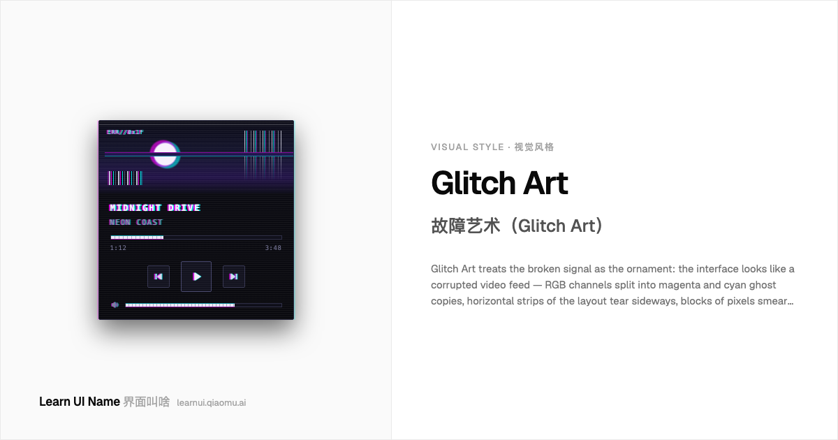
Glitch Artnew 故障艺术(Glitch Art)
Glitch Art treats the broken signal as the ornament: the interface looks like a corrupted video feed — RGB channels split into magenta and cyan ghost copies, horizontal strips of the layout tear sideways, blocks of pixels smear into sorted noise, and the frame flickers like a VHS tracking error. The aesthetic is the display error itself, inherited from 1960s video art, circuit bending, and the databending scene, and revived as UI decoration by 2010s net art.
故障艺术把坏掉的信号本身当作装饰:界面看起来像一段被损坏的视频 —— RGB 通道分裂成品红和青色的重影,布局里一条条横向切片向侧面错位,成块的像素被涂抹成排序后的噪点,整个画面像 VHS 磁迹出错一样闪烁。这套美学就是显示错误本身,上承 1960 年代的录像艺术、电路扰动(circuit bending)和数据折弯(databending)圈子,又在 2010 年代被网络艺术复兴为 UI 装饰。
Nothing matches. Try describing it differently — “the dots menu”, “mac window buttons”.没有匹配的词条。换个说法试试 ——「三个点的菜单」「Mac 窗口按钮」。